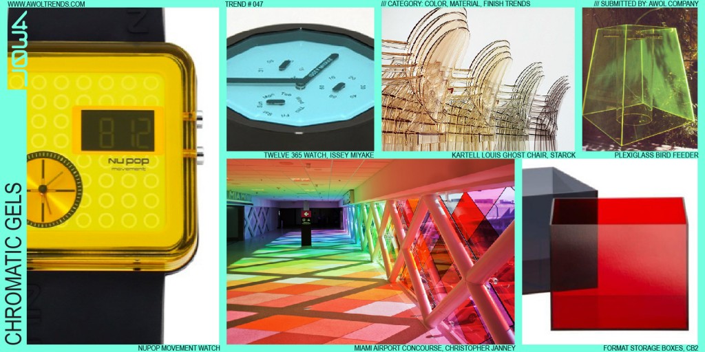
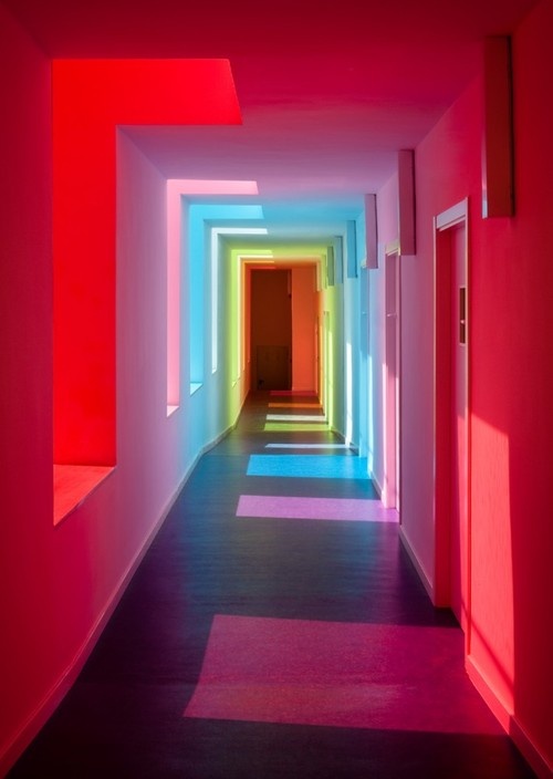
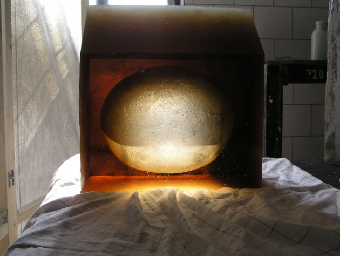
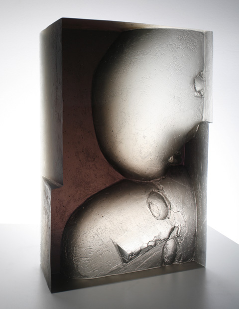
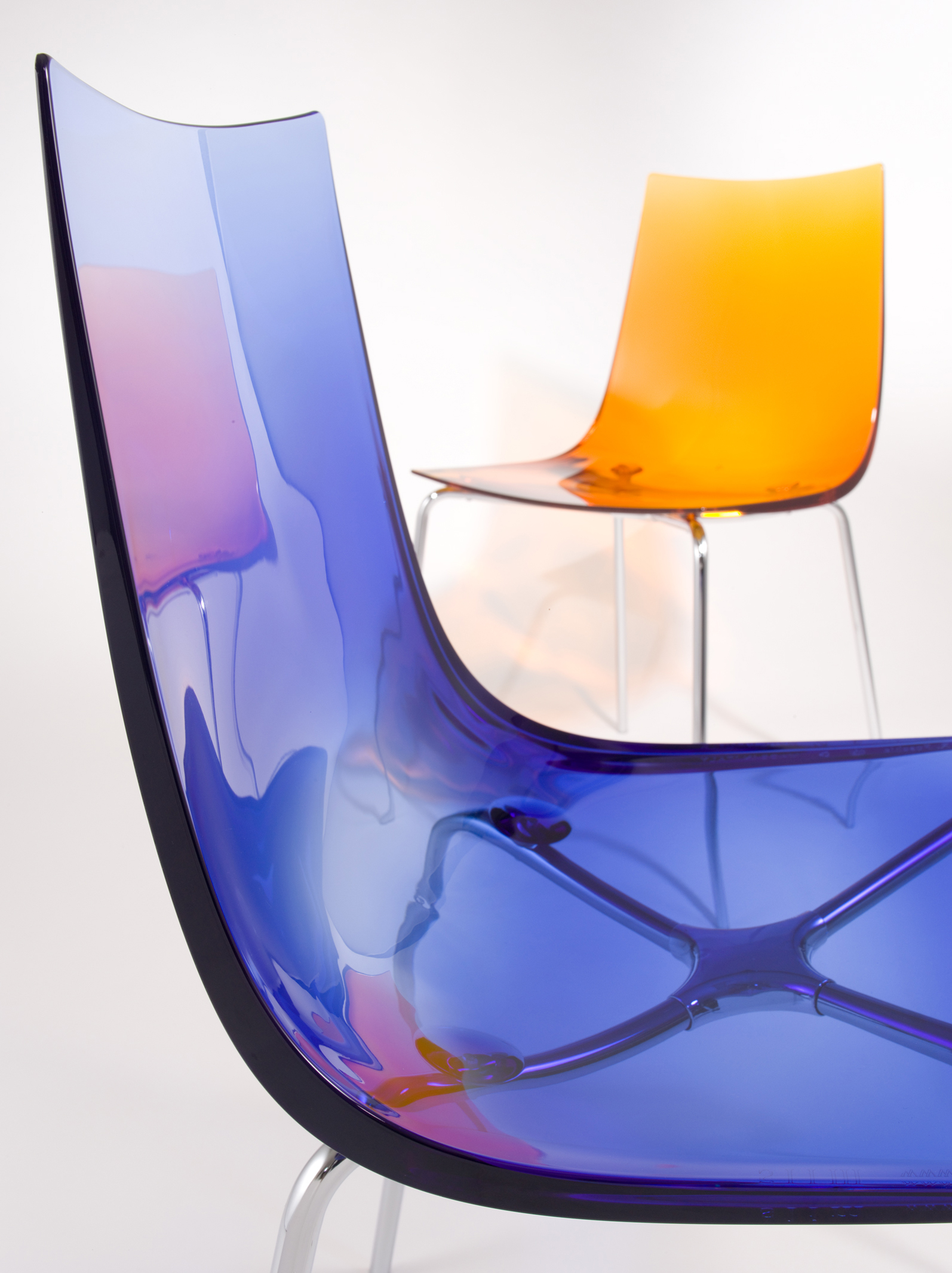
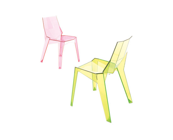
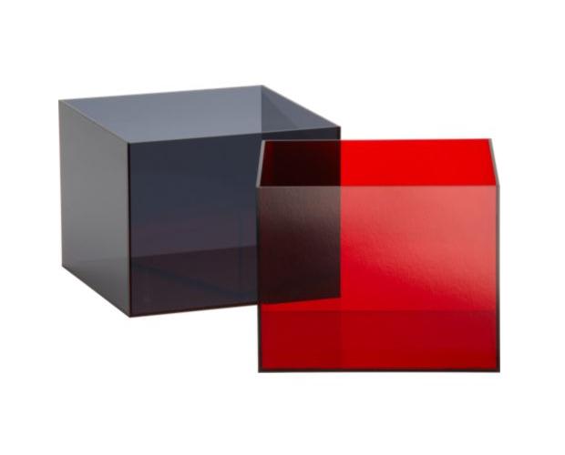
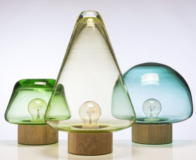
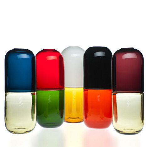
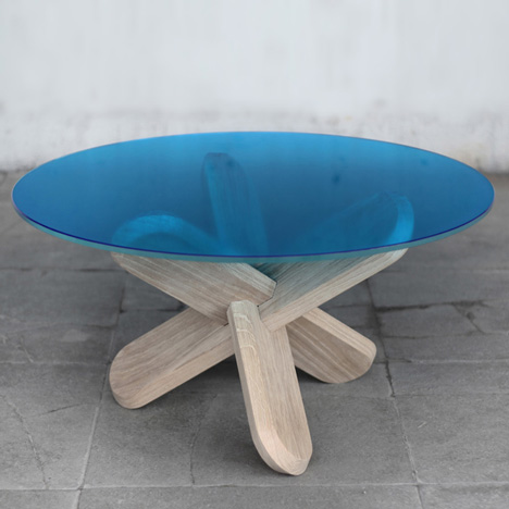
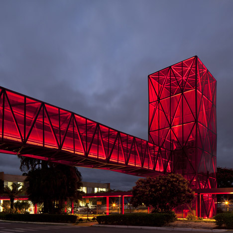
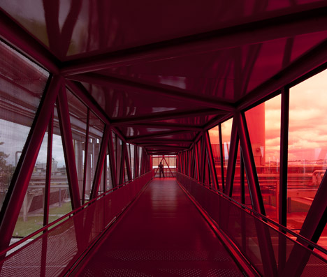
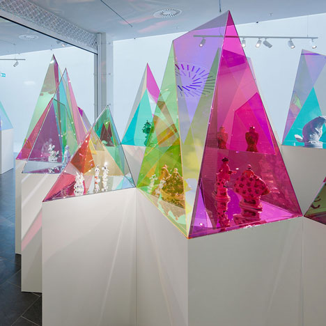
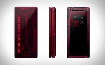
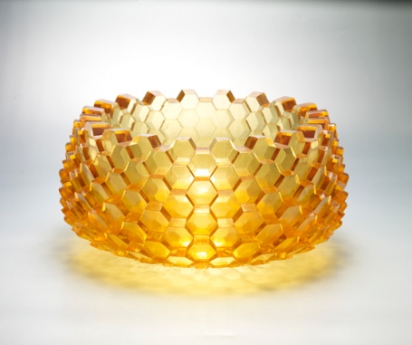
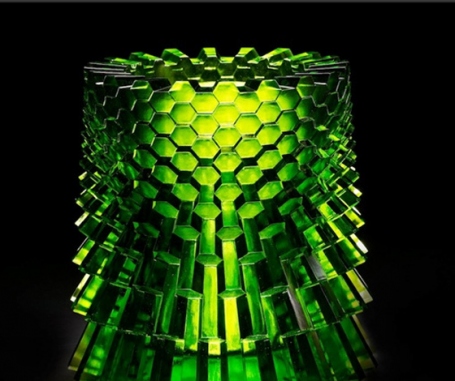
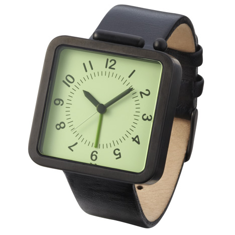
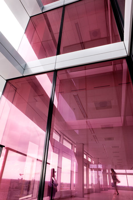
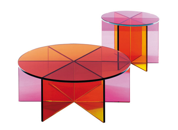
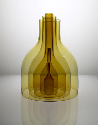
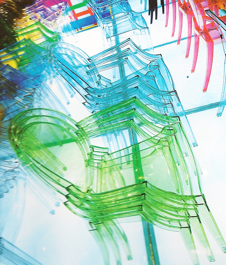
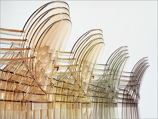
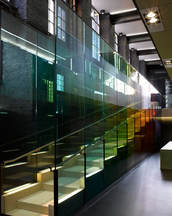
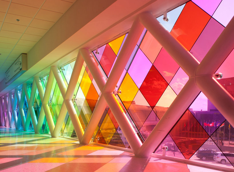
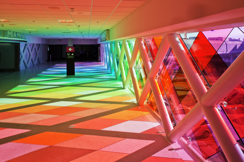
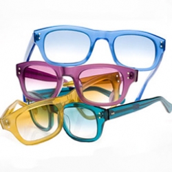
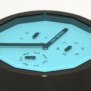
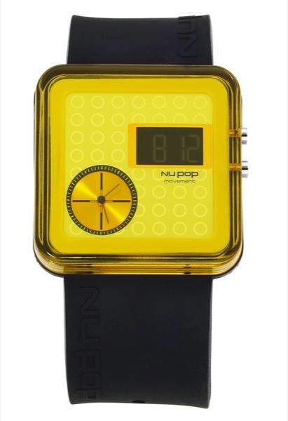
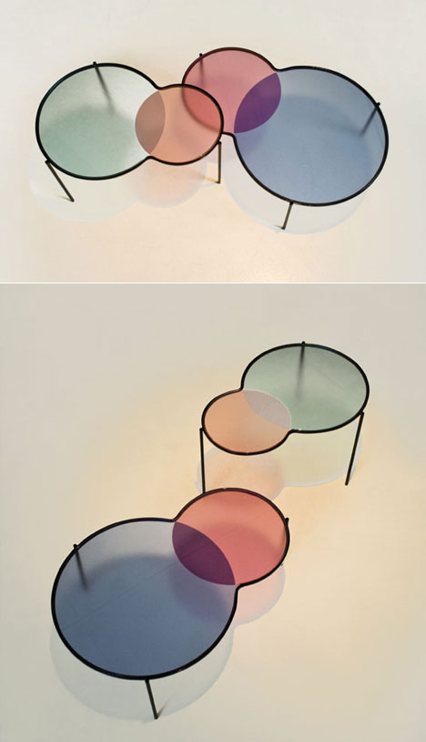
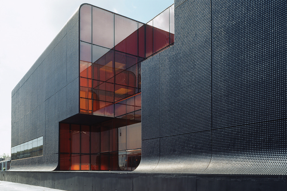
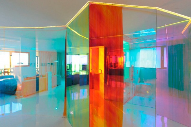
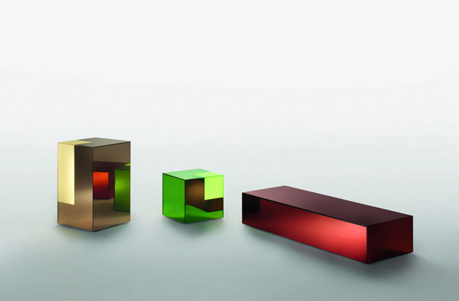
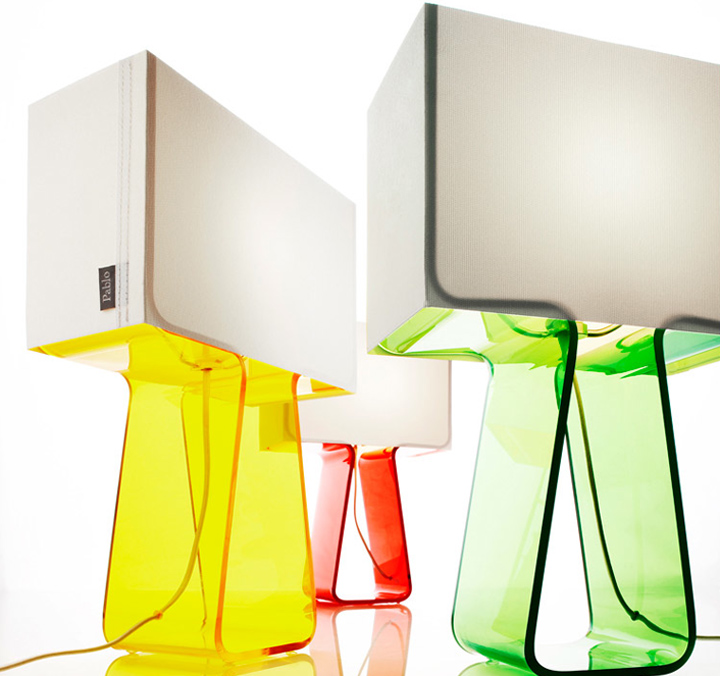
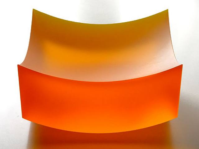
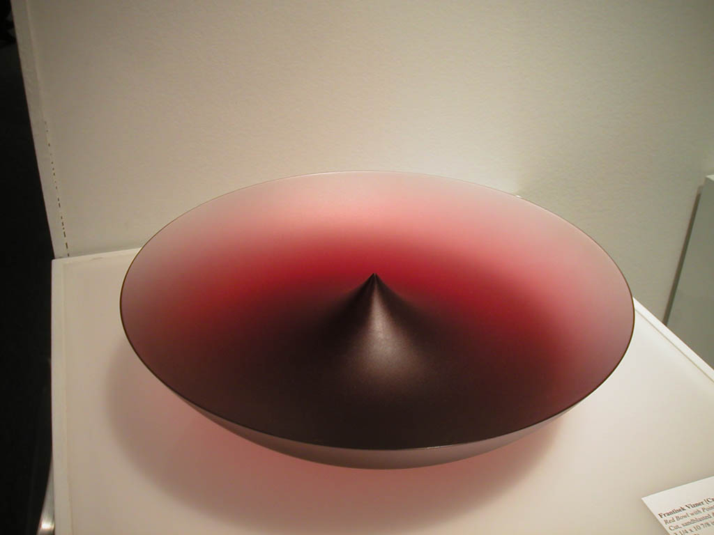
There are only so many colors in the world. Despite Pantone’s claims to “invent” new colors, many of today’s designers are obsessing less about which exact PMS to specify, and more about how transparent it should be. Chromatic Gels is a trend that is finding traction from Architecture to Furniture: the use of highly chromatic colors as semi-transparent surfaces, tinting everything behind them in a rich saturated hue. This is not to be confused with Candy Transparencies, which began with Apple’s rainbow-hued assortment of iMac products in the late ‘90s, and quickly moved down-market. The palettes in this trend are more sophisticated, nuanced, and layered: sometimes just a hint of chromatic tint is used, or more subtle in-between tones are preferred over bright primary colors. Architects like to let sunlight wash through these gel surfaces to change the white incoming sunlight into a tinted dream-like interior glow. Also, edge-lit materials like fluorescent acrylic offer incredibly intense surface-edge color, seeming almost to be lit from within. Whichever the treatment, Chromatic Gels are meant to be strong first-read design elements, not subjugated to small regions or competing with other materials, colors, or forms. Their depth, richness, and lightness are the primary design element upon which every other part of the design should derive. If designing for a line of differently colored products, definitely avoid the “rainbow” effect of having all the primary colors represented at full saturation. Instead, try more subtle, low-intensity variations of those hues, or stay within a very limited range of the color wheel. Transparent Avocado anyone?
CHROMATIC GELS


Great trend. How do you see that its different from the iMac colors from back around 2000? Just curious about this…
Good question, Liam-
When the candy-colored iMacs debuted in the late ’90s, every product category from pens to cameras followed suit, offering a range of intense reds, oranges, greens, blues, and purples as accent colors. These translucent colors were juxtaposed with glossy opaque white main surfaces. Very quickly, this look went down-market and became synonymous with low-end commodity products. Since then, the translucent color aesthetic hasn’t been touched. We have an upcoming trend in our Declining Trends section that covers this (CANDY TRANSPARENCIES). With this trend, Chromatic Gels, the color palettes are much more sophisticated and subtle, often tinting the surfaces underneath with a wash of pale color.
-AWOL Trends
cool. yep., agree. con-kur!
i’ve got it as one of my color trends but haven’t named it yet… except to say color | “clear” … because yep, that’s a big trend as i see it. your description is much more articulate 🙂 , while i’ve just been amassing some pretty pics. http://pinterest.com/katiehatch/color-clear/
interestingly, your site is the first i’ve seen (although honestly i haven’t been searching yet) that shows this as a trend…. why’d ya think that is…?
i agree that the imac colors trend isn’t the same as this. I find the 1980s colored acrylic trend to be more similar; a trend which remained in favor in the home furnishings industry with some Italian manufacturers and niche US product designers.
Thanks for your insight, Katie!
Love your pinterest link by the way….
-AWOL Trends