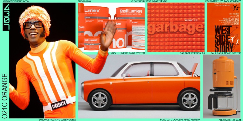
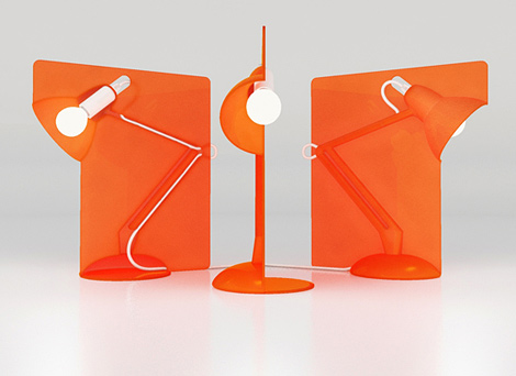
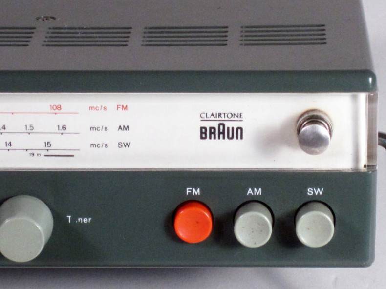
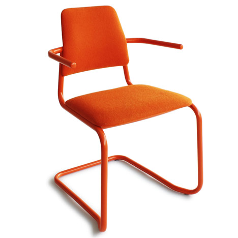
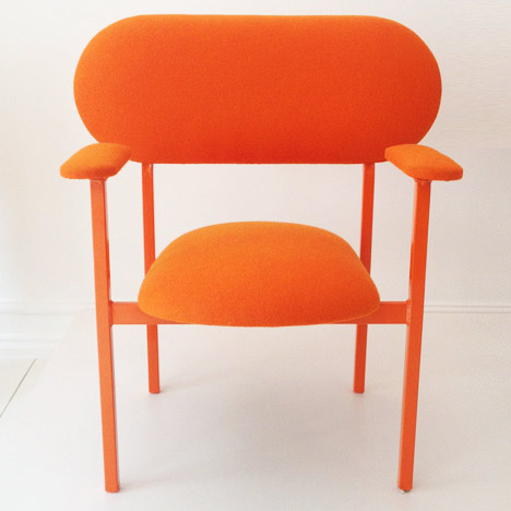
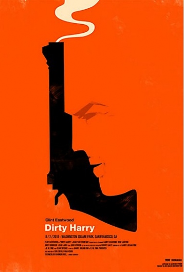
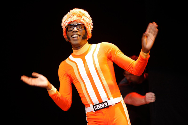
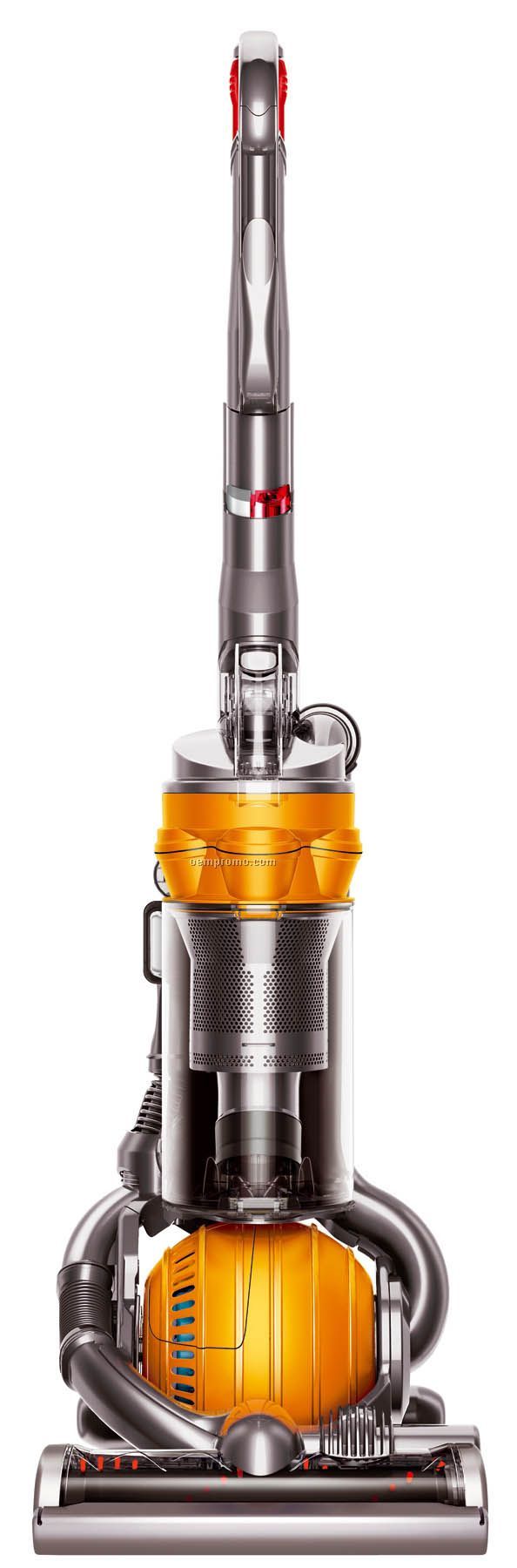
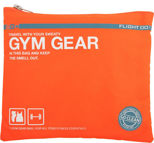
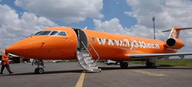
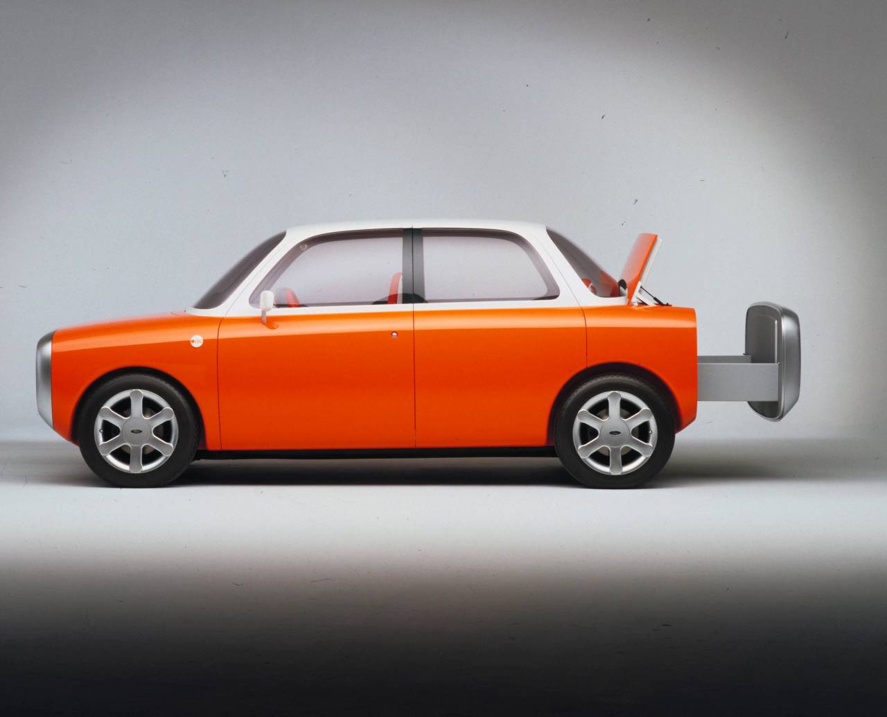
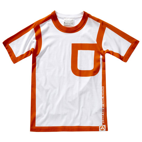
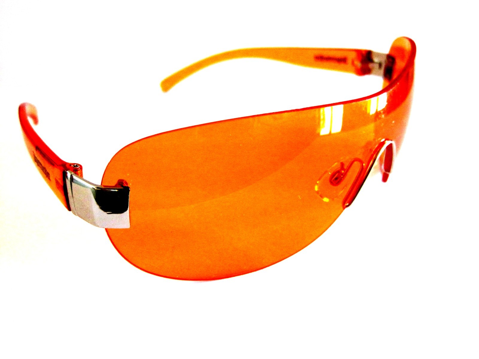
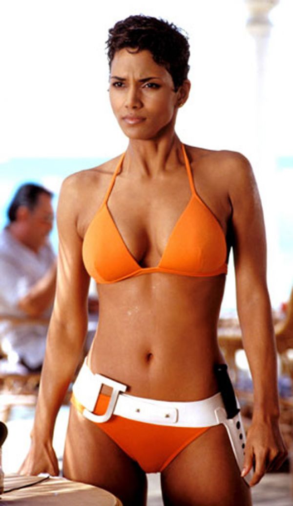
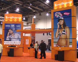
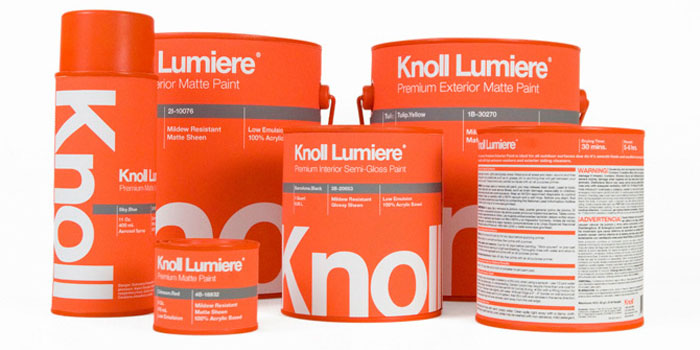
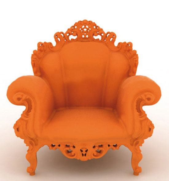
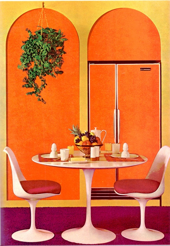
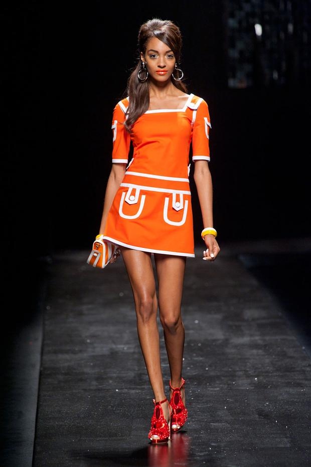
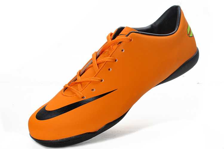
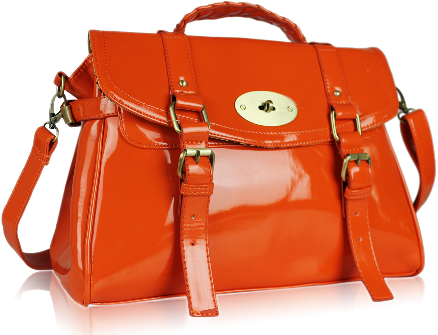
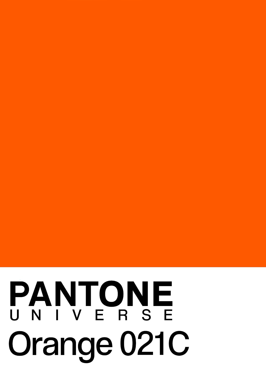
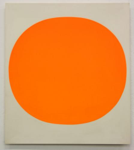
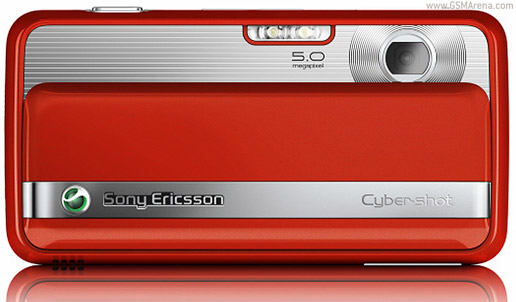
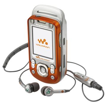
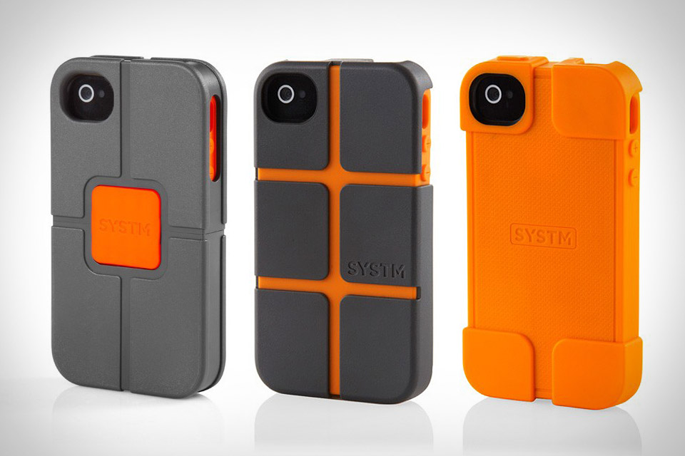
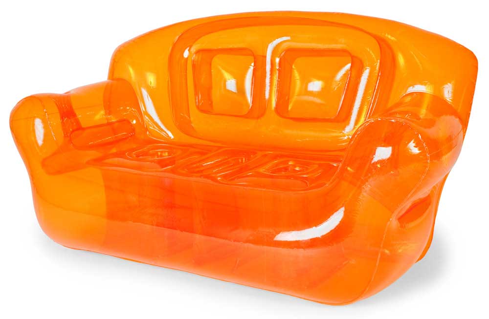
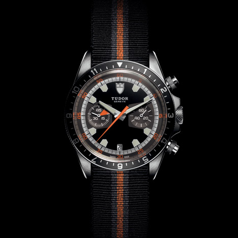
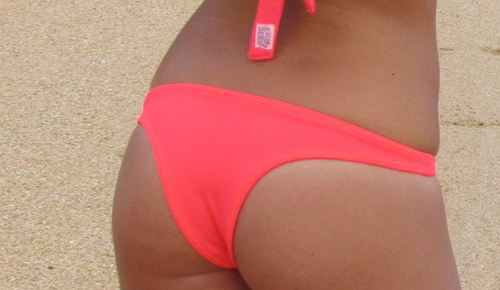
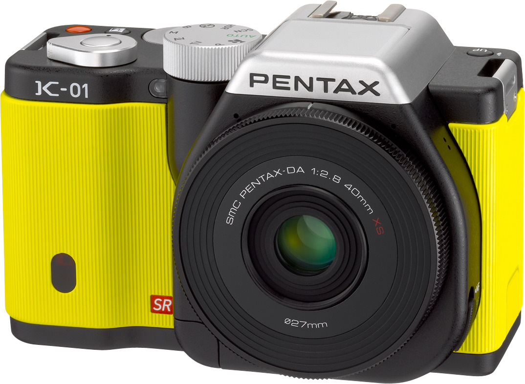
As colors go, orange (specifically Pantone O21c) has had a good run in the design world. Despite taking a back seat through antiquity to various golds, blues, reds, and whites, it would seem the visual merits of the color were finally recognized in the mid 20th century. As the legend goes, a young Bauhaus designer accidentally spilled red and yellow paints together in the early 1960’s, applied it to a Braun radio, and thus started the color’s meteoric rise to the front of every designer’s crayon box. O21c Orange became synonymous with 1960s print media and mod fashion, furniture and interior décor in the 1970s, the General Lee in the 1980s, and then took off in the late 1990s and early 2000s to find itself applied to almost every product in every category. From trade show booths, to MP3 players, to fashion accessories, to branding, this shade of orange became the go-to color for communicating youthfulness, modernity, and devil-may-care flamboyance. Marc Newson’s 021c concept car for Ford, which debuted in 1999 at the Tokyo Auto Show, seemed to be the spark that opened the flood gates for the color’s most recent surge across the design world. It came to be that any designer contemplating a color choice, whether as a small accent or as an entire CMF variation, would default to this ubiquitous hue, almost by pure subconscious instinct. Well, as with all design trends, adoration is always followed by anesthetization. Simply put, this particular shade of orange doesn’t have the visual punch it once did. More discerning designers have moved it to the back of the crayon box, and are instead reaching for alternatives. O21c Orange is evolving into new shades, from last year’s hot color Tangerine, to yellow-oranges, to pinkish oranges, to traffic-cone fluorescent oranges. Or even out of that neighborhood of the color wheel entirely: for example the Process Colors (Cyan, Yellow, Magenta) are seeing a huge surge in many categories. We don’t advocate discarding the color entirely, in some product categories which lag behind the general aesthetic curve (we’re looking at you, Medical), O21c Orange may still be a very appropriate color solution as an accent or indicator. Whether this declining trend impacts global demand for orange Tic-Tacs, time can only tell.
O21C ORANGE


Also orange is really big in cultural significance for signage and emergency use. Like traffic cones, construction signs, life jackets. I think this is because the eye is really drawn to this color. Those examples are more florescent than the orange you are talking about though.
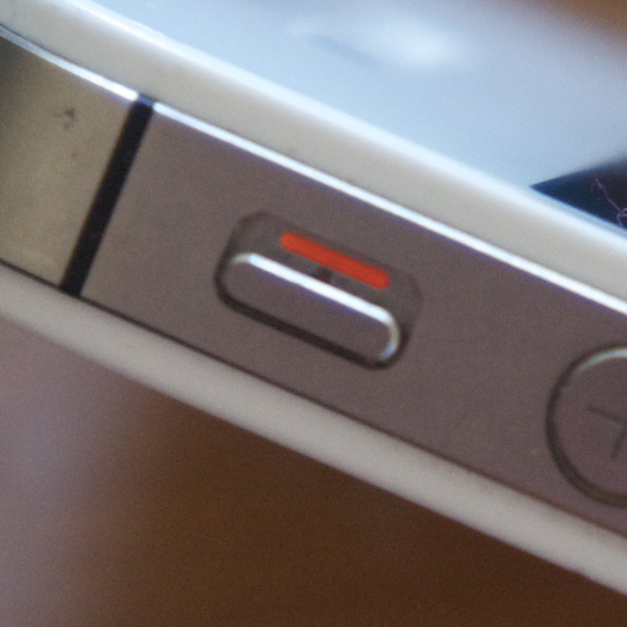
That’s an excellent point, Ms. Doll. One of the reasons it is so often used in traffic signage or safety gear is because the eye really alerts to this color immediately. It’s like a magnet for your attention. Usually in these instances, it’s the more fluorescent variety of orange. Also known as Day-Glo orange, this shade is still very on-trend and current, and is a good alternative to Pantone 021c.
For some additional discussion of this declining trend, here’s a link to the Core77 LinkedIn Group:
http://www.linkedin.com/groupItem?view=&gid=162413&item=231108530&type=member&commentID=133264055&trk=hb_ntf_COMMENTED_ON_GROUP_DISCUSSION_YOU_CREATED#commentID_133264055
(you may have to be a LinkedIn member to view)
-AWOL Trends