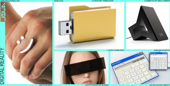
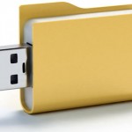
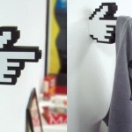
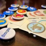
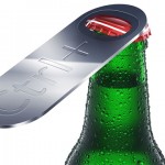
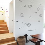
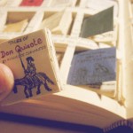
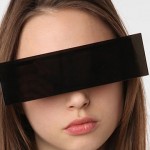
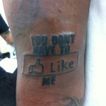
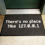
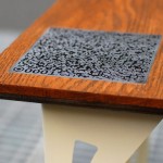
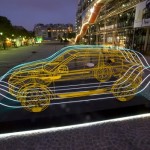
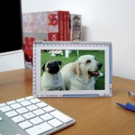
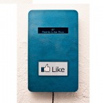
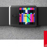
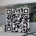
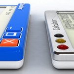
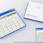
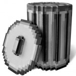
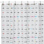
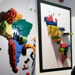
When the digital age truly arrived in the mid-90’s, digital UI designers worldwide were challenged to envision the aesthetic of this new medium. Not surprisingly (and very cleverly), they drew upon metaphors familiar in the real world: folders, arrows, hands, buttons, drop-shadows, transparencies. These intuitive cues helped users make the transition from physical to digital when graphic GUIs were still being defined. Even today, elements like faux-brushed aluminum, glossy buttons, and drop-shadow regions are still in vogue for digital design. But now that the digital realm is so near to our actual reality, these digitized versions of reality are being re-translated back into the physical world. They maintain some element of either vector graphics or pixelization, trying to mimic their digital counterparts as closely as possible. The flatness of the digital display is also maintained: these are essentially two-dimensional objects. The real question remains: will Clippy make the journey into our world? One can only dream…











Great examples, great post. I notice this trend being very popular in the last two years. Do you think it is hear to stay for a long time or is it being declined?
Hi Antonio-
We believe Digital Reality will continue to evolve beyond the short term novelty. The speed at which new icons enter our digital vocabulary (QR codes, Like buttons, App icons, etc) are increasing at an accelerating rate, providing fresh source material to feed this aesthetic. At some distant future point, our digital experiences will cease to rely on a 2D, pixelated, flat display, however. Once this happens, and virtual environments lose this iconic flatness, then the line between virtual and physical will really be blurred.
-AWOL Trends