Category Archives: 05. COLOR/MATERIAL/FINISH TRENDS

Color, Material, and Finish trends (often referred to as CMF) are the most widely tracked trends in the creative field. Whole organizations are devoted to predicting (or rather proclaiming) what will be next year’s hot colors or pattern. In the housewares and fashion industries, for example, the Color Marketing Group meets yearly to coordinate what the next year’s palettes will be. This is incredibly useful for a brand that manufactures for a retailer like Target, who wants to coordinate vast quantities of varied products into a cohesive color scheme. Materials trends are more rarely tracked, mostly in the architecture/interior design categories. Finish is even more rare, and involves the fine surface texture of a material (i.e. brushed vs. bead-blasted vs. glossy vs. matte). One thing about color that is highly predictable: there are no new colors being invented. Therefore treating CMF in new and fresh ways is critical for creating differentiated products.

EPHEMERA

We are surrounded by objects that are constantly fighting for our visual attention. From consumer electronics like TVs and smartphones, to consumer packaged goods like cereal, detergent, or soda, from fashion to furniture, the products we depend on in our lives are always shouting “Look at me! Pay attention to...

Read more
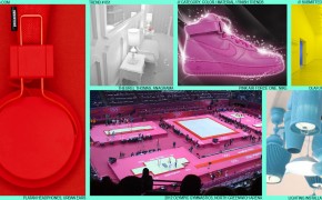
COLOR DIPPING

As designers, we’re always looking for a strong first-read stylistic element that will attract the target user’s immediate visual attention. In the last few years, a trend has emerged that exclusively uses a single color to create this aesthetic hook. Very simply, Color Dipping involves (sometimes literally) dipping a complete...

Read more

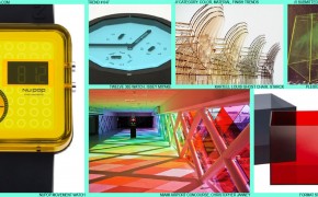
CHROMATIC GELS

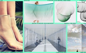
There are only so many colors in the world. Despite Pantone’s claims to “invent” new colors, many of today’s designers are obsessing less about which exact PMS to specify, and more about how transparent it should be. Chromatic Gels is a trend that is finding traction from Architecture to Furniture:...

Read more

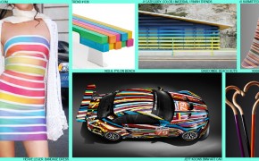
RAINBOW STRIPES

Although rainbows have been a frequently occurring visual theme in modern culture (kid’s characters, hippies, the GLBT community, Mork), in recent years they have been increasingly present in the Product, Fashion, Furniture, and Architecture categories. Possible reasons behind this resurgence are many (these colors are particularly vibrant against today’s prominent...

Read more

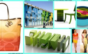
FRESH GRADATIONS

Although achievable easily in oils and watercolors, the gradations we see in the natural world around us have always been hard to replicate in production. The first explorations of gradation appeared in print with the invention of half-tone patterns. Not until digital tools arrived in the late 20th century did...

Read more

COLOR REINTERPRETATION

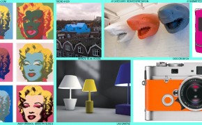
In keeping with the Reinterpretation theme, Color Reinterpretation maintains all design elements of the original icon, but alters the color in new and striking ways. Andy Warhol’s Marilyn prints illustrate this effect perfectly: taking the widely and immediately recognized icon of Marilyn’s face, and layering on a cascade of vibrant...

Read more

CERAMIC AND GLAZE

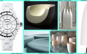
The use of ceramics by humans has been chronicled since our earliest recorded history. Some of the very first artifacts in the archaeological record are fired mud ceramic vessels. Fast forward tens of thousands of years into the future: today we are surrounded by ceramics, from Chia Pets to ceramic...

Read more

AQUA-BLUE DIPPED

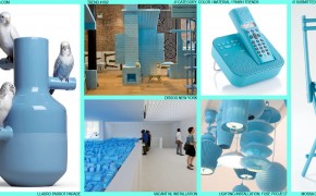
This early trend seems poised to establish the new “it” color across many product categories. Orange and Lime Green have long faded, Silver is toast; this sky-blue echoes the modern need for a color that’s restful and inviting, but also fresh and current. Currently it is emerging heavily in the...

Read more