Tag Archives: heritage

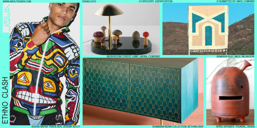
ETHNO CLASH

Western design has effectively permeated the global aesthetic culture. You can go to any country in the world and see either the influences of Western design, or the objects of Western design themselves (iPhones, cars and SUVs, Nike sneakers, glass skyscrapers, Coke cans, high heels and sport coats, bicycles, sunglasses,...

Read more
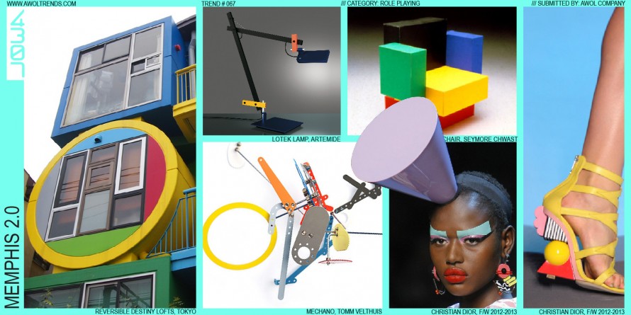
MEMPHIS 2.0

It’s hard to invent a new aesthetic. That’s probably why it happens so infrequently. However, that did not stop a young Milanese (Ettore Sottsass) and a small group of other European designers from giving it a real shot. In 1981, their Memphis aesthetic debuted at the Salone del Mobile furniture...

Read more

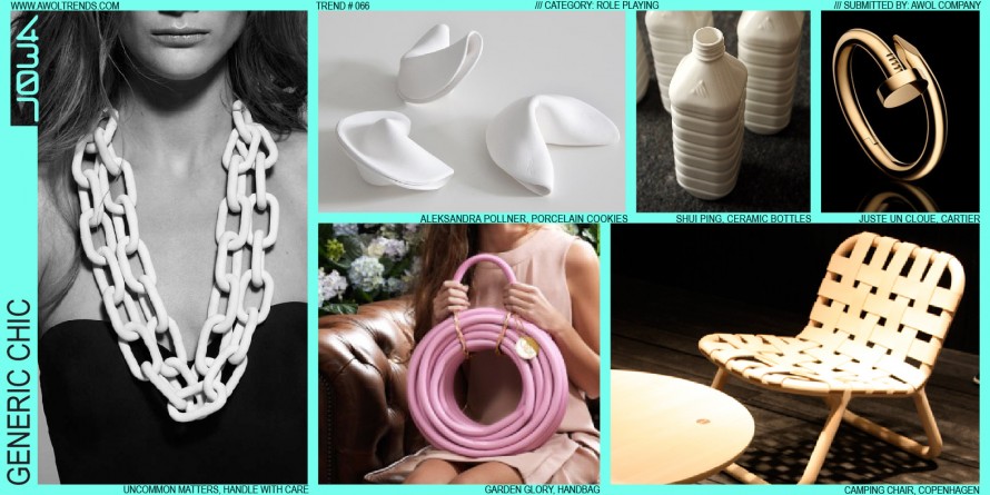
GENERIC CHIC

Designers in the Premium/Luxury categories have always striven to differentiate their work from the great unwashed teaming masses of regular consumer products. In trying to communicate “I am better than you”, products in these categories have relied on such design levers as length (stretched limousines), height (top hats and rooftop...

Read more

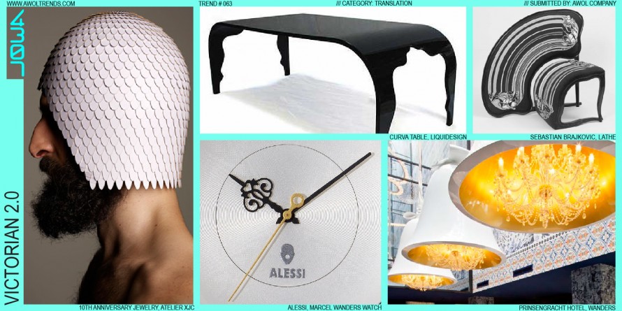
VICTORIAN 2.0

In Fashion, style is mostly cyclical (with repeating themes currently on a 25-year cycle). In other design categories, however, the wavelength has been a bit longer. Roughly 150 years ago, some clever folk called the Victorians set about changing the world with their Industrial Revolution and, among other things, their...

Read more

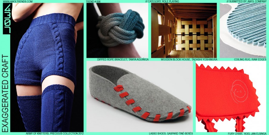
EXAGGERATED CRAFT

Some aesthetic themes arise purely as a counterpoint to an established visual mode. For decades, we’ve surrounded ourselves with increasingly polished, seamless, perfect objects; from smartphones to automobiles, the stylistic vector has been ever towards shiny, sleek, rational, and technological. Made by machines, with all hints of an artisanal human...

Read more

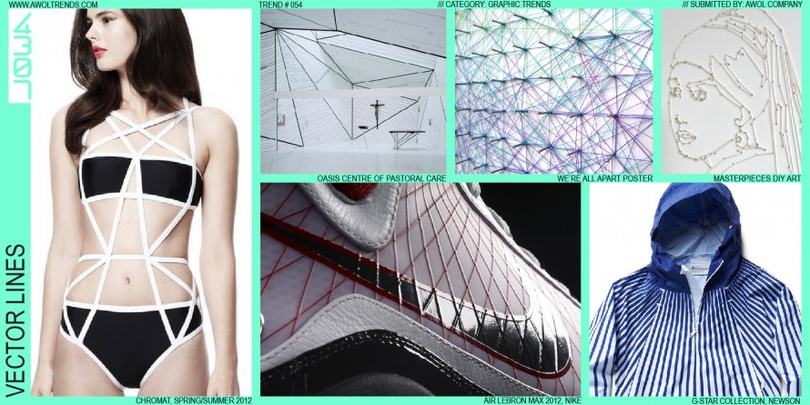
VECTOR LINES

We’ve posted several trends about the interplay between the digital and physical worlds. One aspect of the digital aesthetic that has emerged, coinciding with a broader revisiting of 1980’s design cues, is the Vector Line. Originally, this element was introduced via early 1980’s (even late 1970’s) arcade graphics: Asteroids, Tempest,...

Read more

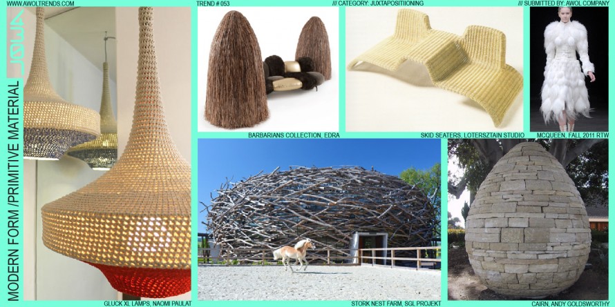
MODERN FORM/PRIMITIVE MATERIAL

In keeping with the Juxtaposition category’s deliberate fusion of disparate ideas, this trend focuses on the union of both form and material, and past and present. This one-two punch of clashing design elements and design eras tickles our creative minds in all the right places. Using this method, we see...

Read more

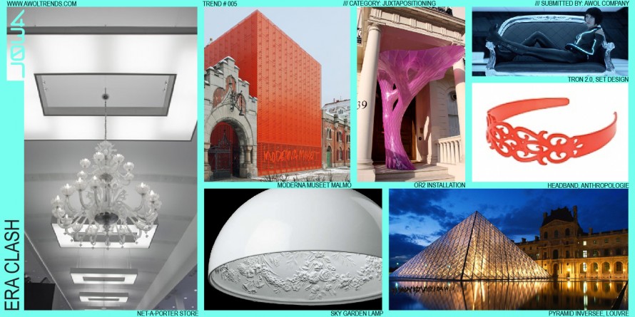
ERA CLASH

In keeping with this category’s theme of mashing disparate concepts together, here we see stylistic motifs from two distinctly different visual eras juxtaposed together. This method first appeared at the Milan furniture fair in the mid 2000’s. The most common combination so far has been more Baroque/Victorian themes with modern...

Read more

ICONIC REINTERPRETATION

  We are surrounded by a rich terrain of icons, visual metaphors that are immediately recognizable to everyone. Depending on your age, cultural background, or region, we each possesses a unique catalog of icons onto which we load meaning and past experience. Some icons are incredibly powerful, due to their...

Read more