Tag Archives: trends

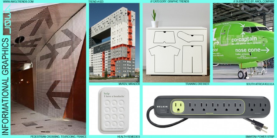
INFORMATIONAL GRAPHICS

The nature of most technology, be it a plane, a building, or a computer, is to hide the scary complicated internal workings within a simplified outer shell. For the most part, this out-of-sight-out-of-mind approach removes the level of intimidation most users feel when interacting with technology for the first time....

Read more
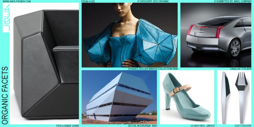
ORGANIC FACETS

In keeping with this category’s exploration of the interplay between the natural and man-made worlds, Organic Facets highlights a specific surfacing technique that embodies this tension. This method was inspired by the Stealth Fighter of the 1990’s, that matte-black, wedge-like assortment of triangles that seemed not only unable to fly,...

Read more

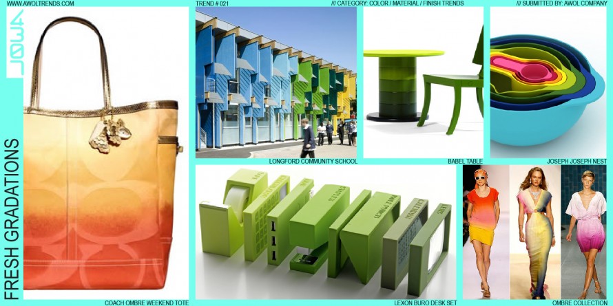
FRESH GRADATIONS

Although achievable easily in oils and watercolors, the gradations we see in the natural world around us have always been hard to replicate in production. The first explorations of gradation appeared in print with the invention of half-tone patterns. Not until digital tools arrived in the late 20th century did...

Read more

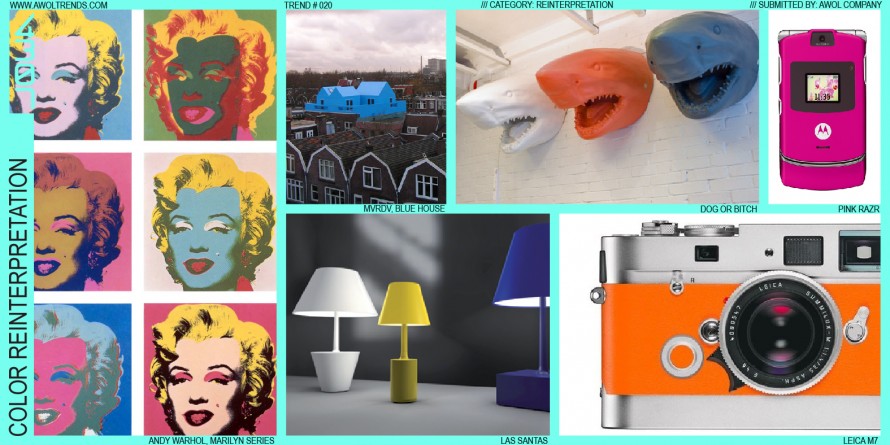
COLOR REINTERPRETATION

In keeping with the Reinterpretation theme, Color Reinterpretation maintains all design elements of the original icon, but alters the color in new and striking ways. Andy Warhol’s Marilyn prints illustrate this effect perfectly: taking the widely and immediately recognized icon of Marilyn’s face, and layering on a cascade of vibrant...

Read more

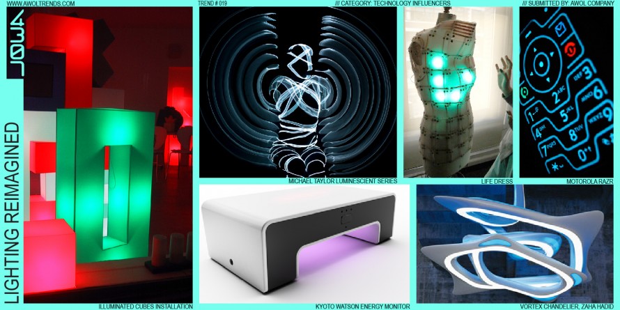
LIGHTING RE-IMAGINED

Lighting has been a persistent element of modern consumer electronics design since the early 20th century: early radios, vacuums, and ovens glowed with incandescent readouts. Little changed until the LED was introduced in the 1980s into consumer products, which revolutionized the ability of designers to add light both as a...

Read more

SILVER PAINT

Silver paint is a Declining Trend, but the story of its rise to glory is worth knowing. Around the late 1990s, starting in the Consumer Electronics category, silver paint started a decade-long march across the design community. The inception was most likely two sources: the long use of lightly metallic-flaked...

Read more

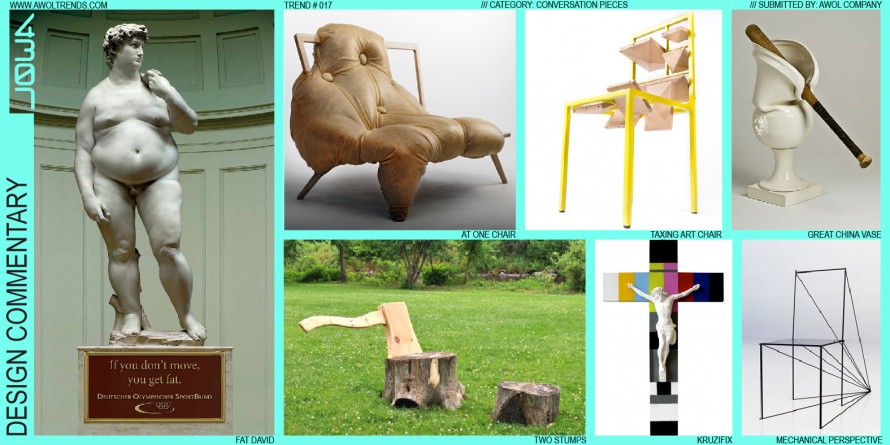
DESIGN COMMENTARY

We designers have powerful tools at our disposal. We can quickly call upon 2D, 3D, physical, and virtual methods to re-envision the world around us in very convincing and compelling ways. Sometimes that energy is channeled not into developing design concepts, but rather to illustrate societal issues in new ways....

Read more

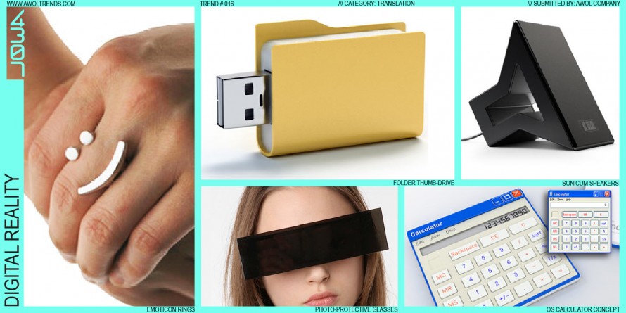
DIGITAL REALITY

When the digital age truly arrived in the mid-90’s, digital UI designers worldwide were challenged to envision the aesthetic of this new medium. Not surprisingly (and very cleverly), they drew upon metaphors familiar in the real world: folders, arrows, hands, buttons, drop-shadows, transparencies. These intuitive cues helped users make the...

Read more

GUERILLA BRANDING

Dramatic shifts in the interplay between brands and their target customers have driven some interesting methods of pushing a brand’s message into the world. As customers abandon old channels of media consumption, savvy marketers must fight to gain brand exposure wherever there is even a fleeting chance of potential exposure....

Read more

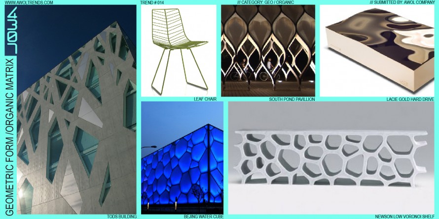
GEOMETRIC FORMS / ORGANIC MATRIX

In keeping with this category, highlighting the dynamic balance between the Rational and Natural worlds, Geometric Form/Organic Matrix captures one specific method of achieving this balance. In this theme, a purely geometric form, often based on a primitive such as a cube or rectangle, defines an absolute outer boundary volume....

Read more