Tag Archives: color

ETHNO CLASH

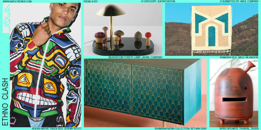
Western design has effectively permeated the global aesthetic culture. You can go to any country in the world and see either the influences of Western design, or the objects of Western design themselves (iPhones, cars and SUVs, Nike sneakers, glass skyscrapers, Coke cans, high heels and sport coats, bicycles, sunglasses,...

Read more

MEMPHIS 2.0

It’s hard to invent a new aesthetic. That’s probably why it happens so infrequently. However, that did not stop a young Milanese (Ettore Sottsass) and a small group of other European designers from giving it a real shot. In 1981, their Memphis aesthetic debuted at the Salone del Mobile furniture...

Read more

EXAGGERATED CRAFT

Some aesthetic themes arise purely as a counterpoint to an established visual mode. For decades, we’ve surrounded ourselves with increasingly polished, seamless, perfect objects; from smartphones to automobiles, the stylistic vector has been ever towards shiny, sleek, rational, and technological. Made by machines, with all hints of an artisanal human...

Read more

COLOR DIPPING

As designers, we’re always looking for a strong first-read stylistic element that will attract the target user’s immediate visual attention. In the last few years, a trend has emerged that exclusively uses a single color to create this aesthetic hook. Very simply, Color Dipping involves (sometimes literally) dipping a complete...

Read more

CHROMATIC GELS

There are only so many colors in the world. Despite Pantone’s claims to “invent” new colors, many of today’s designers are obsessing less about which exact PMS to specify, and more about how transparent it should be. Chromatic Gels is a trend that is finding traction from Architecture to Furniture:...

Read more

RAINBOW STRIPES

Although rainbows have been a frequently occurring visual theme in modern culture (kid’s characters, hippies, the GLBT community, Mork), in recent years they have been increasingly present in the Product, Fashion, Furniture, and Architecture categories. Possible reasons behind this resurgence are many (these colors are particularly vibrant against today’s prominent...

Read more

FRESH GRADATIONS

Although achievable easily in oils and watercolors, the gradations we see in the natural world around us have always been hard to replicate in production. The first explorations of gradation appeared in print with the invention of half-tone patterns. Not until digital tools arrived in the late 20th century did...

Read more

COLOR REINTERPRETATION

In keeping with the Reinterpretation theme, Color Reinterpretation maintains all design elements of the original icon, but alters the color in new and striking ways. Andy Warhol’s Marilyn prints illustrate this effect perfectly: taking the widely and immediately recognized icon of Marilyn’s face, and layering on a cascade of vibrant...

Read more