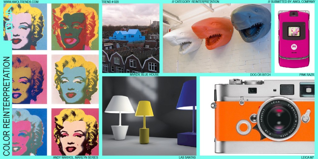
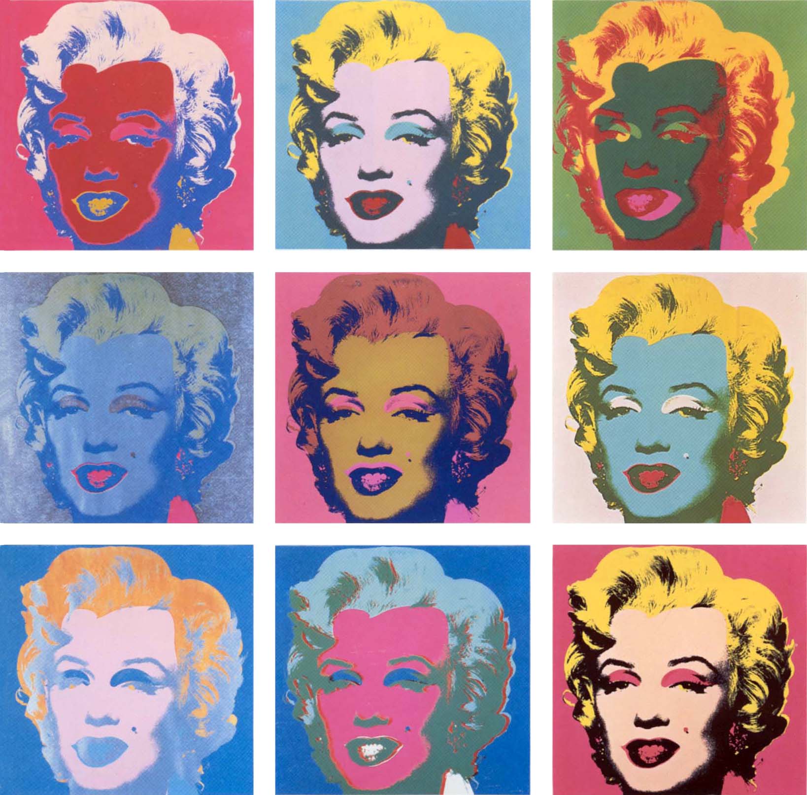
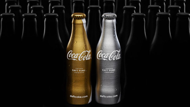
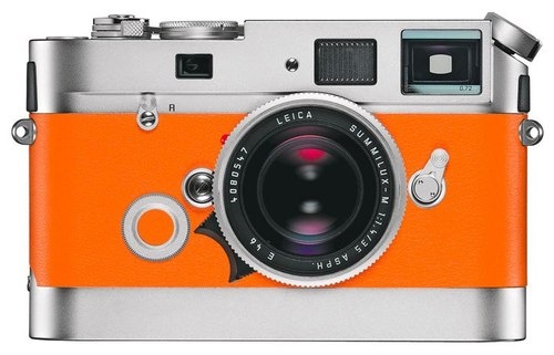
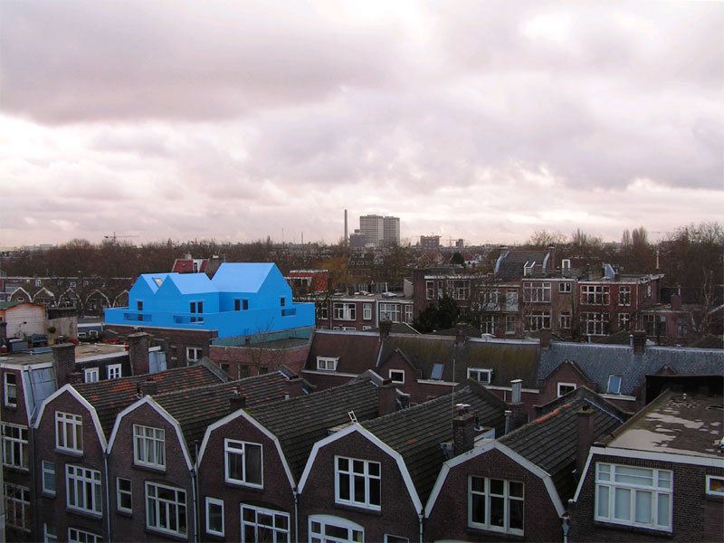
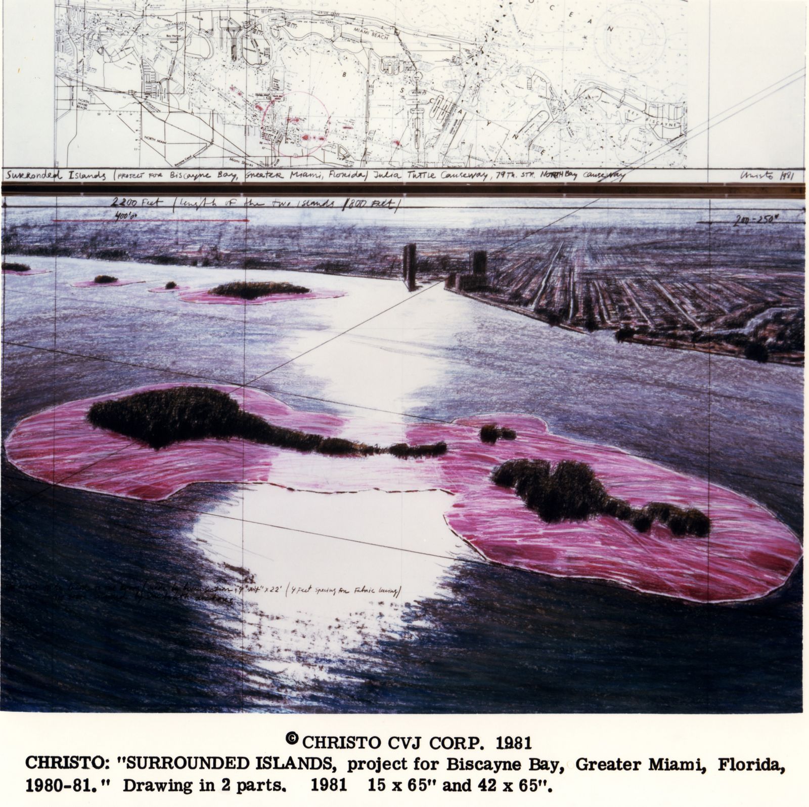
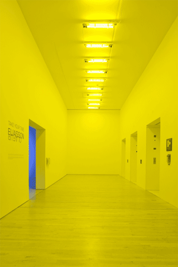
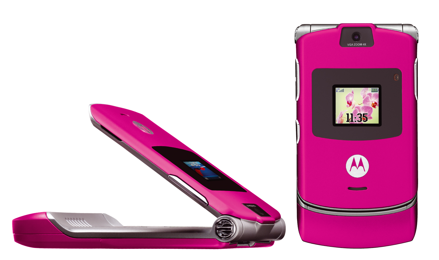
In keeping with the Reinterpretation theme, Color Reinterpretation maintains all design elements of the original icon, but alters the color in new and striking ways. Andy Warhol’s Marilyn prints illustrate this effect perfectly: taking the widely and immediately recognized icon of Marilyn’s face, and layering on a cascade of vibrant colors. As with all trends in this category, the key is choosing an icon that is immediately recognizable. Then colors are applied that are intended to jar the mind out of its normal chromatic association with that icon. At once familiar and new, the effect immediately creates a sense of delight and forces us to re-examine the icon’s meaning. This is generally the most easily-achieved of the Reinterpretation themes, as it could entail a process as simple as dipping an object in a can of paint. Although it may have originated in the Pop Art movement, Color Reinterpretation has been a common theme in interior design for many years, as decorators seek to imbue old or familiar décor with modern or contrasting color palettes. It is just beginning to move into the product design discipline.
COLOR REINTERPRETATION


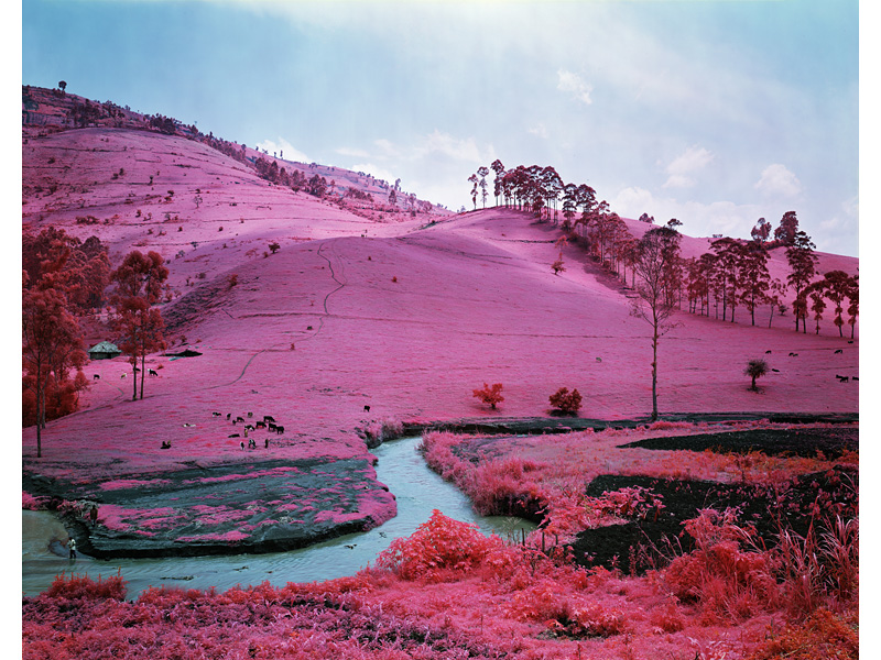
This is definately a trend you are seeing more of this days, but such a great way to create something new and fresh for something that people just walk by and ignore every day. Maybe man hole covers, street lights, thinkgs like that would be really cool to see done in this trend.