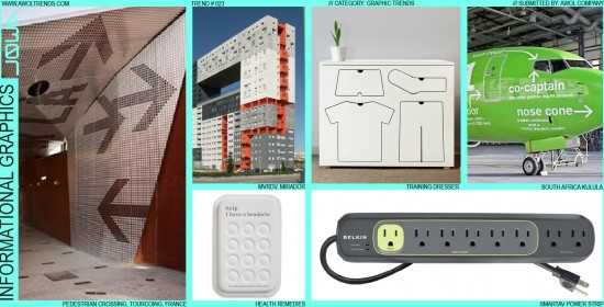
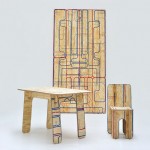
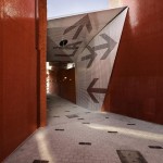
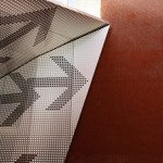
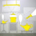
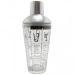
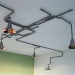
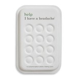
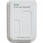
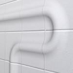
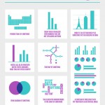
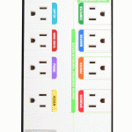
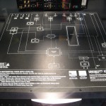
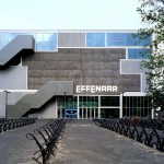
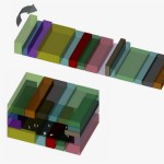
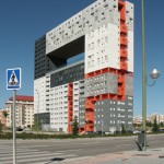
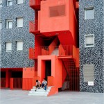
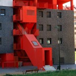
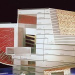
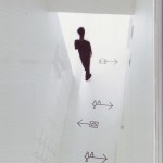
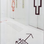
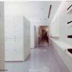
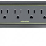
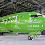
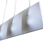
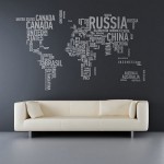
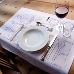
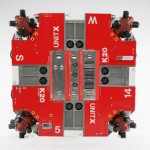
The nature of most technology, be it a plane, a building, or a computer, is to hide the scary complicated internal workings within a simplified outer shell. For the most part, this out-of-sight-out-of-mind approach removes the level of intimidation most users feel when interacting with technology for the first time. The Informational Graphics trend seeks to demystify the world around us by giving cues into the basic concepts internally at work, or even suggesting the proper methods of interaction. This trend started in the Environmental Design discipline through graphic informational signage, and has migrated into Architecture and other categories. The treatment need not be limited to two-dimensional graphic applications, but can extend into colored regions or three-dimensional surface sculpting to indicate underlying structures. In a world where technology is at once overwhelming and ubiquitous, such visual cues remind us that these devices are here for our benefit and understanding. Just imagine this applied to the Fashion or Automotive categories…







Love the concept, but that is because I am like you! But I think we are the minority in this world where most people are not critical observers and often lack the need to understand the inner workings of the world. Unless the observer is in an investigation mode (first time learning experiences like finding the restrooms, operating a faucet with a strange handle or none at all, or knowing what technology is buried in that consumer product on the shelf at the store) I believe people normally do not want to see all of the detail that challenges the mind to work more. Life is complicated enough for many people, and adding visual cues that create more noise in their mind might be psychologically exhausting. Minimized detail can be more soothing, and particularly in a private home it can be a very desirable escape from a busy life. But again, that is not me. You will find all of my most current science projects draped through the home of my hard-loft with all of the exposed elements – and people that know me, know that I am more intense than the norm.
Great observations…I think the successful examples of effective infographics beyond the computer screen is when it is helping or assisting in some way. Leveraging the existing data base of graphics we hold in our mind (handicap, stop signs, arrows) to create a more attractive and intuitive experience is what we need more of, in my opinion. Blending the physical architecture with the the information is something I believe people are going to be expecting more of in the future. Imagine interactive subway maps that span entire walls…this video is an interesting take on the future of information…
https://www.youtube.com/watch?v=a6cNdhOKwi0&feature=player_embedded
Great video Glen! Thanks for posting. There are several compelling aspects to this trend. On one hand, it could provide very useful graphic guidance for people trying to navigate a space or interact with an object. On the other (as in the airplane example), it simply becomes a novel way to handle exterior graphics, in a tongue-in-cheek whimsical way. Either way, it works.
-AWOL Trends
You’re right, Jay: this trend is not for everyone, or for every product category. Our recognition of trends in general on this site are independent and unbiased, identifying what could be used during any given design project. Whether it should be used we leave entirely up to you. That said, I think a little sign that says “Jay”, with a little arrow pointing down to your favorite chair (ideally with you sitting in it) would be an awesome addition to your loft…
-AWOL Trends