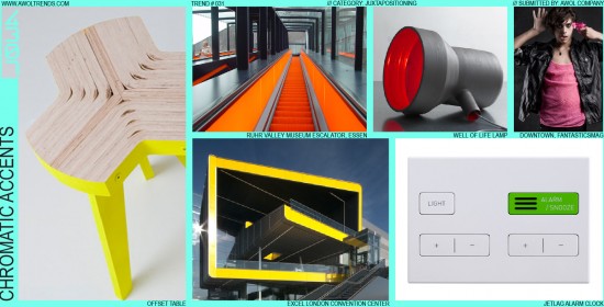
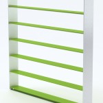
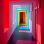
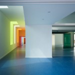
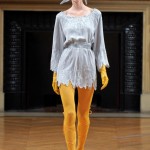
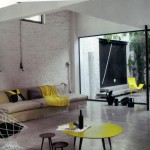
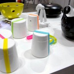
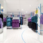
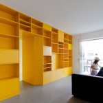
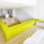
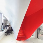
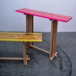
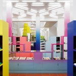
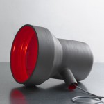
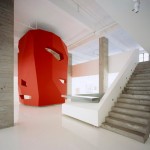
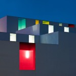
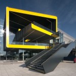
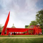
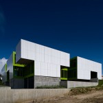
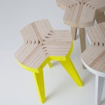
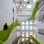
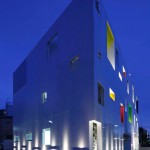
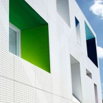
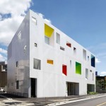
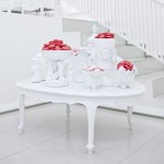
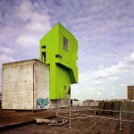
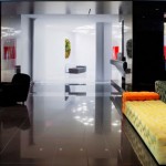
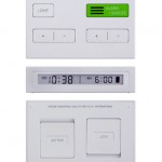
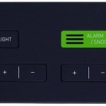
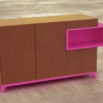
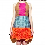
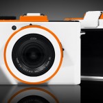
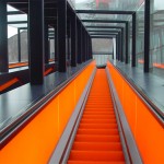
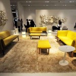
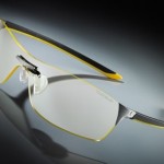
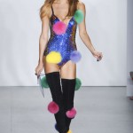
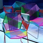
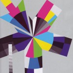
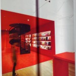
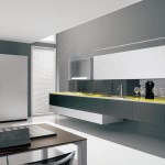
In keeping with the theme of the Juxtaposition category, this trend highlights the use of an intense color accent to contrast with a more muted primary color palette. The result is an immediate first-read dissonance that makes the accent color really pop as a vibrant element in an otherwise orderly design. This trend started showing up in earnest in the mid-2000s, particularly in Fashion, as ‘80s revival swept through the industry. One of the hallmarks of ‘80s design, Day-Glo neon colors, saw a resurgence through brightly colored accessories and graphic patterns. Chromatic Accents then moved into Furniture and other categories. The technique is most effective when the main color palette is subdued, de-saturated, and monochromatic: grays, whites, blacks, or bleached wood tones. The accent colors then really have a background on which to contrast, and are best shown as primary colors (R, Y, B), process colors (C, M, Y), or anything fluorescent. Avoid deep, rich low-value accent colors as they lack the chromatic punch to create the visual slap-in-the-face this trend dictates. Hunter Green: No. Neon Pink: Yes. Concepts that stick to a single accent color (as opposed to several different bright accents) seem to strike the right balance between contrast and cohesion.












Great examples, I will be using this ideas on my next projects definately! It is very helpful to know that any color won’t work with these trend, it seems like it has to be specifically neon or very bright?
That’s right Jerry: the brighter the intensity of the color the better, even pushing into fluorescents is totally on-trend. With Orange on the decline as an accent color in many categories, look to pink/magenta, cyan/aqua, and lime yellows.
-AWOL Trends
Check out Marc Newson’s latest Pentax camera design, prominently featuring the Chromatic Accents trend:
http://www.fastcodesign.com/1669084/marc-newson-designs-a-new-camera-for-pentax-and-the-tech-nerds-hate-it
-AWOL Trends