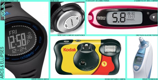
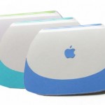
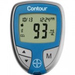
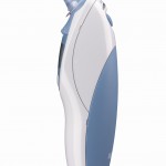
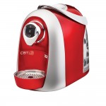
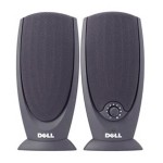
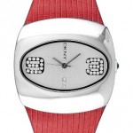
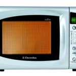
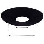
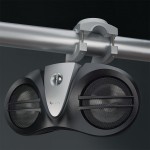
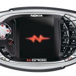
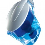
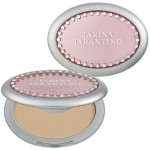
The use of Arcs and Ellipses to define physical shapes is a Declining Trend. For some perspective on this form/graphic design element’s origin: designers in the mid to late 1990s were extremely fond of putting arcs and ellipses on anything that wasn’t nailed down. The advent of 3D CAD modeling tools and Adobe Illustrator meant creating these fluid shapes was as easy as clicking a button. Arcs and ellipses became the most-used tool in many designers (and design consultancies’) visual toolbox (and I include myself in that description). There was no straight edge that wasn’t begging for some degree of arcing, and no form that wasn’t crying out for a nice parabolic arc or ellipse right in the middle, perhaps with a screen or brand mark centered within. Many designers felt they weren’t “doing their jobs” if they didn’t introduce some amount of curvature somewhere on a product. However, the turn of the century brought a new respect for the clean lines of Minimalism and Rationalism, with brands like Apple and Motorola leading the charge. These days we respect a good, unapologetic straight line, and ellipses are almost never seen as a graphic element (having been replaced by the “racetrack” or “pill” shapes). There are some brands (Bose, we’re looking at you) that still adhere to this Declining Trend as part of their visual DNA, and many medical and home appliance brands are still working with this theme, however those categories have always lagged the general aesthetic curve. We recommend using these stylistic elements sparingly. Arcs and Ellipses are fundamental geometries, and certainly aren’t going away. However, all product categories are moving away from this visual theme, so avoid making them a strong first-read visual statement (or risk looking like a late ‘90s Ford Taurus…enough said).
































[…] tool in many designers (and design consultancies’) visual toolbox….Read the full post HERE Posted in ACIDO News, General Interest, Industrial […]
I’m so glad you pointed this out, this look is totally tired! But designers are still doing it! WTF?!
We think designers are still doing it in certain categories (medical, housewares, home appliances, some audio) because its still semi-viable in those categories. However, the prevailing stylistic wind is for this aesthetic to decline overall.
-AWOL Trends
I’m so tired of this look, thanks for calling it out. Just need a few more nails in the coffin!