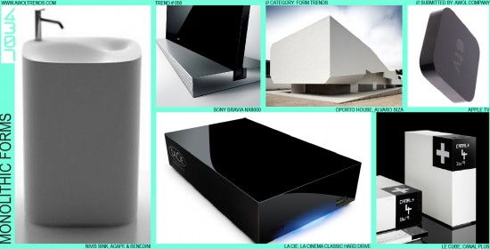
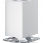
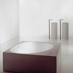
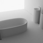
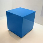
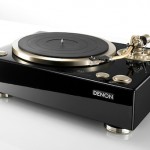
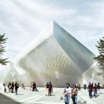
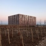
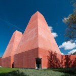
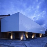
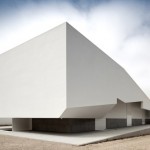
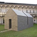
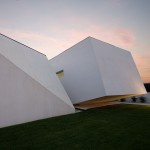
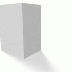
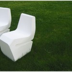
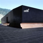
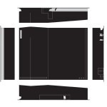
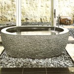
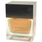
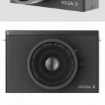
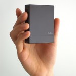
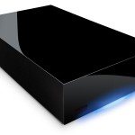
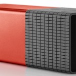
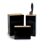
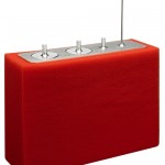
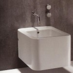
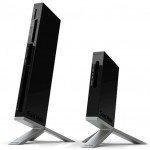
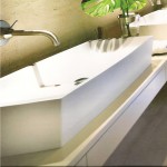
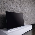
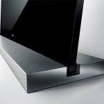
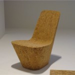
With the misinterpretation of designers as “form-givers” yielding highly complicated, over-styled forms, several aesthetic themes have emerged to bring restraint and confidence to this over-worked design element. One of the most interesting to emerge has been Monolithic Forms. This stylistic mode involves an interplay of key elements: minimalism, massiveness, and primitive geometries. Most often, pure rectangular forms are used, although any basic geometry will be effective. Surfacing and detailing are very minimal, with simple, unadorned, flat planes being most commonly used. Any parting lines that break the overall form into separate parts should be minimized (by hiding on non-visible surfaces), or even completely eliminated. The visual effect of this treatment is that the form has been carved or milled from a single block of material, retaining a deep sense of mass. Parting lines or extraneous details betray this intent, making the form seem comprised of thin sheets and being essentially hollow instead of solid and massive. Monolithic Forms seemed to originate first in Architecture, with the use of basic, heavy geometries, often suspended above the ground by a structural framework. Interior fixture designers picked up the theme with massive cast porcelain sinks and tubs. Then the Consumer Electronics category adopted this aesthetic mode as well, in hard drives, computer enclosures, high-end audio gear, etc. One challenge with employing this trend is at the initial sketch level: Monolithic Forms are not incredibly impressive when first drawn on paper. Clients presented with a range of nicely sketched rectangles may be inclined to feel the designer didn’t give it their fullest effort. In this case, presenting a convincing set of inspirational images, or even showing more refined realistic CAD renderings may be a better method of getting initial buy-in. Or might we suggest just showing the Monolith from 2001?













More explanation about the “form-giving” statement in this trend:
http://www.linkedin.com/groupItem?view=&gid=3610818&type=member&item=137575121&commentID=89138373&report.success=8ULbKyXO6NDvmoK7o030UNOYGZKrvdhBhypZ_w8EpQrrQI-BBjkmxwkEOwBjLE28YyDIxcyEO7_TA_giuRN#commentID_89138373
(for LinkedIn members)
-AWOL Trends
This website is an amazing resource!! Moodboards can take a really long time to make, and this website gives an amazing head start. Keep up the good work and please don’t ever take it down 🙂
Thanks for letting us know how valuable AWOL Trends is for you, Kara. Keep checking in, it will only keep growing with more trends added every couple weeks.
-AWOL Trends
hey,
firstly i love your site. this is exactly the type of trend study i was looking for. anyways i had this question, i wanted to know if mixing two or several trends or modes is usually practiced.
I also wanted to tell you that I am from India, and I had read the trend tracking article and about understanding the trends from this part of the world. I have just graduated in product design, but presently it is kind of my mission to understand and practice Indian Design, mostly through developing products with Indian values in them. But presently the product development work happening in India is mostly inspired from western ideas and thoughts. I have done some work with respect to this and would love to share it with you.
Hi Sahaj-
Thank you for the feedback. We’d definitely be interested in learning about what you’re seeing in India. Feel free to contact us using the Submit page, and we’ll get the conversation started.
-AWOL Trends