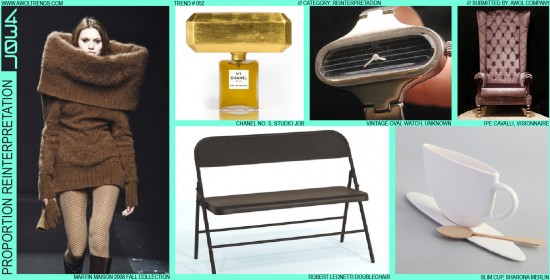
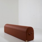
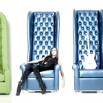
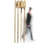
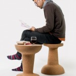
In keeping with the Reinterpretation category, this trend builds on the concept that familiar icons can be refreshed and revitalized by specifically amplifying a single key design attribute. Proportion Reinterpretation explores scaling, stretching, or compressing an object’s proportions. This can be simply scaling the object, stretching it along one of its axes (that’s the plural of axis, we had to look it up…), compressing it along a single axis, or selectively amplifying one aspect of an object while maintaining the rest of the icon (as in the Chanel and Martin Maison examples). This trend has been explored in almost all design categories (Transportation, Furniture, Interiors, Product, Architecture, although not in Digital yet), but has its origins in the historic aesthetic of luxury. Stretched limousines, high ceilings, top hats, sky-scraper-top penthouses, proportions are one of the most commonly used design elements to communicate the iconography of wealth. This method has certainly moved mainstream, although in smaller degrees. The minor stretch required to go from a Mini Cooper to a Mini Clubman (while preserving the original icon) is still palatable to the general buying public. The sky-high seat back of Ipe Cavalli’s Visionnaire chair is clearly meant to dominate a room, be a visual statement, and be accessible to only a very exclusive few. So designers: smoosh, stretch, and scale to your hearts’ content (but if it’s for the consumer market, maybe just not quite so much…).
- Caption

















All these looks really say luxury to me. I think you are right about this
Thanks Tia. We’ll be exploring the unique aesthetic cues of Luxury in an upcoming post. Check back soon!
-AWOL Trends