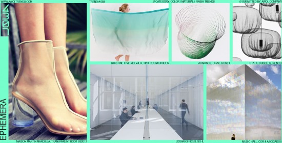
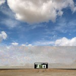
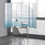
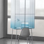
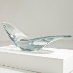
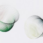
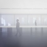
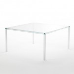
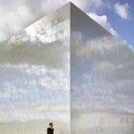
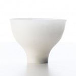
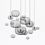
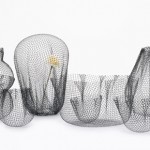
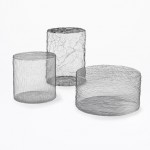
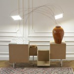
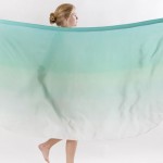
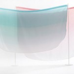
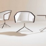
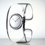
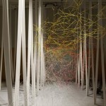
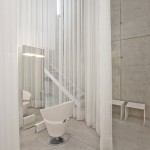
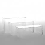
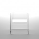
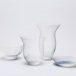
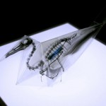
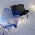
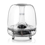
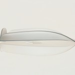
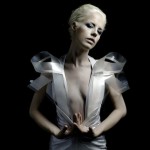
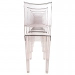
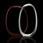
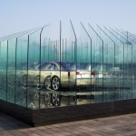
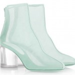
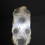
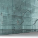
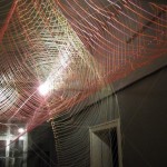
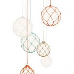
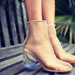
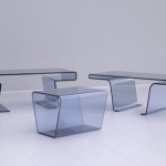
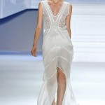
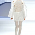
We are surrounded by objects that are constantly fighting for our visual attention. From consumer electronics like TVs and smartphones, to consumer packaged goods like cereal, detergent, or soda, from fashion to furniture, the products we depend on in our lives are always shouting “Look at me! Pay attention to me!”. Typically our job as designers has been to fuel this struggle for attention, skillfully tweaking design elements like color, material, form, branding, or lighting to generate maximum visual impact and differentiation. But if everything is unique and iconic, then nothing is. Do you really want your Blu-Ray player or toothbrush or shampoo to be doing the visual equivalent of ALL CAPS SHOUTING at you, all day long? A movement has begun that runs counter to the assumption that good design is loud design. Through many different techniques, designers in a variety of categories have begun to explore objects that recede from our attention rather than command it. Primarily this has been through manipulation of an object’s colors and materials to create an ephemeral quality. Transparent plastics or glass allow the background to blend through the product, fine wire mesh membranes that flow and bend with the lightness of solidified smoke, gauzy translucent fabrics that float and diffuse light, reflective panels that blend into the surrounding sky: these techniques create almost ghost-like objects. They have a mystique that still draws the user in due to the subtle hint of structure and obscurity, but in a much less forceful manner. The Ephemera theme produces objects that are sensed before they are truly seen and understood, almost like a mirage. It is related to Minimalism, but even Minimalism can produce strikingly intense visual design. Typical color palates range into lighter/white tones, but even the dark wire mesh constructions possess the same gossamer lightness. Naturally, this trend would have difficulty being applied across the board to every product category. CE products or automobiles with extensive internal componentry may end up looking more complicated if those parts were shown through a translucent outer housing. But for products whose internal volume is mostly void of technical components, and if the competitive market is full of ANNOYINGLY LOUD products, then the Ephemera trend might provide a breath of fresh air for visually assaulted consumers.






Regarding this “trend”, when you say “a movement has begun”, where is the movement happening? Is this counterpoint being discussed somewhere by designers as an intentional conversation about the direction of design? Just seems like a very definitive statement thats all.
JJ-
Here are 50 examples, across a wide range of design categories, of a stylistic theme that in recent years is gaining momentum: our definition of a trend. It exists within a broader aesthetic framework, full of similar observations of our aesthetic landscape. Design is a visual medium: we discuss these ideas by weaving them into our creative efforts, observing, borrowing, and inspiring others. You’re free to discuss them either amongst your own creative circle, or here on AWOL Trends as a venue for everything aesthetically related. Hope that helps you grapple with your questions…