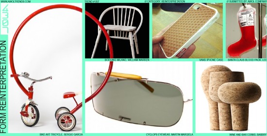
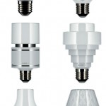
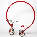
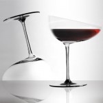
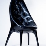
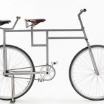
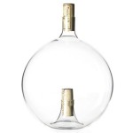
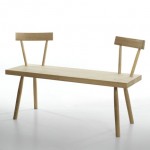
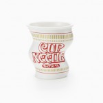
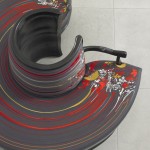
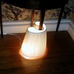
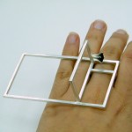
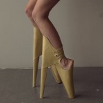
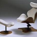
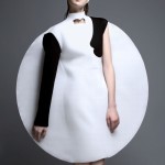
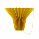
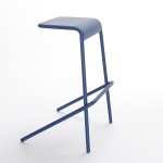
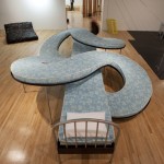
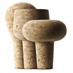
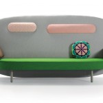
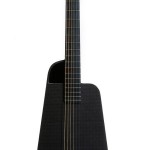
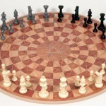
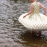
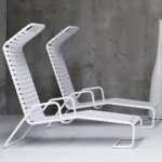
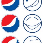
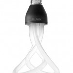
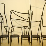
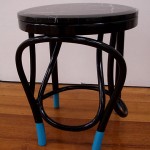
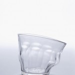
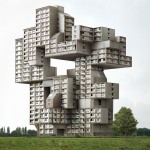
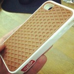
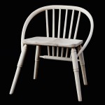
In keeping with the Reinterpretation theme’s principle of modifying a single aspect of a design, the Form Reinterpretation trend focuses purely on…FORM! This general stylistic mode seeks to present familiar cultural icons back to the consumer in fresh ways that create both a sense of familiarity and surprise. In these examples that focus only on form, it is critical that all other aspects of an icon remain unchanged (proportions, materials, color, graphics, etc.) so that the change in shape can be fully noticed and appreciated. This trend has its roots in the Furniture category, as designers sought to create bespoke pieces that would command attention at the Milan Furniture Fair in the late 2000s (and reinterpreting old icons can create just as much acclaim as unveiling something completely new). It moved into Installation Art, with artists reinventing familiar icons from bikes to aircraft, and has just started to show up in more mainstream product design. Regardless of creative category, it is critical that the designer begin with selecting an icon that is truly familiar and instantly recognizable as part of the cultural landscape: using new forms/products will not work. You cannot RE-interpret what has never been interpreted in the first place, or is still getting chewed on by the cultural molars. Lightbulb (incandescent or fluorescent)= good icon to use (see the Plumen bulb example). Burt Rutan’s SpaceShip One = bad icon to use (because it’s so new and futuristic, we’re all still getting used to it). Our own personal rule of thumb for an icon’s cultural permeation is: if five-year olds are drawing it with crayons, then that’s a good sign. In most of these examples, the result is more of a tongue-in-cheek result (the tricycle, most of the chair concepts), although in the case of the Vans iphone case, the application of this trend makes perfect sense, aligning with both brand heritage and functional need to create a viable consumer product. If applied to the right category, this trend has the potential to spark real stylistic and functional innovation, as well as jar our aesthetic expectations.







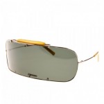









This is very cool. I like the glasses and the red bycycle. Seems so simple to do this trend?