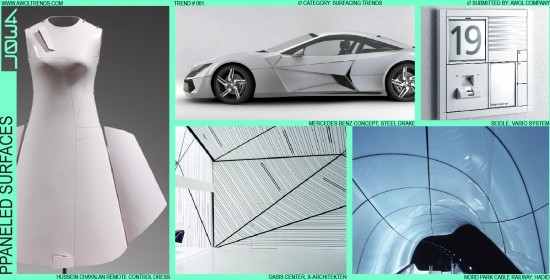
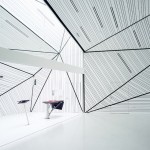
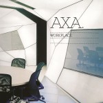
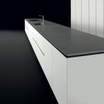
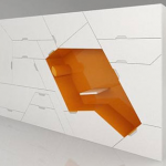
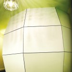
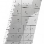
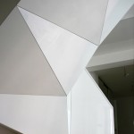
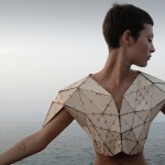
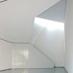
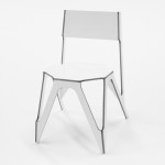
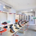
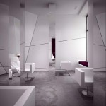
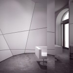
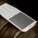
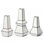
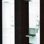
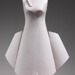
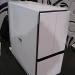
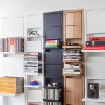
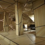
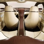
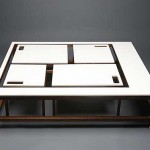
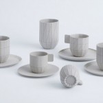
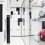
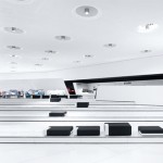
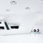
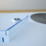
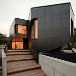
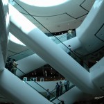
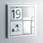
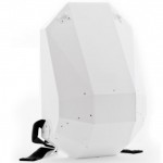
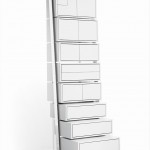
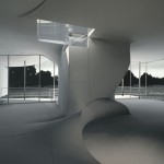
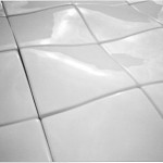
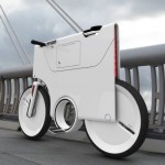
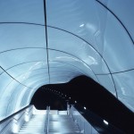
Traditionally in design, an object’s form takes priority. Once a form is finalized, then it is subsequently broken up into pieces for production, via parting lines, panels, segments, or assemblies. With the Paneled Surfaces trend, the construction methodology becomes the aesthetic: arrays of discreet panels interlock to define a surface, thereby constructing a form. The resulting forms can be angular (see the Organic Facets trend), flowing and naturalistic, or rational and geometric. But the panel geometry adheres to definite themes: either orderly square grids that flow with the surface, or fragmented facets of triangles or other angular shapes. But they are always geometric patterns, never organic patterns (another Trend captures that variation). As you can see from these examples, the color white has been the preferred compliment to this aesthetic, best for showing off the dark grooves between panels. Those gaps between panels should also be accentuated: one panel should never meet flush with its neighbor, lest the entire effect be negated. Black is a secondary color choice, but then the gap color (usually black) is much more subtle. This trend has been incubating in the Architecture category for the last few years, in particular modern interior environments. It broke into the Product category in the late-2000’s with the debut of products like the Wii and Kindle, and then most recently into Furniture. From a functional point of view, his stylistic mode is particular useful when these panels conceal points of interaction (used to great effect on the Wii), which can swing open to reveal secondary design elements. So if you’ve got some spare drywall or styrene sheets laying around the shop, put them to use: Paneled Surfaces may be the right aesthetic for your product category.









Nice, Andy!
You should visit Starbucks and buy one of their new paneled coffee cups/packaging etc.
Just saw that! Although, technically, I would put that under the Organic Facets trend under Geo/Organic
-AWOL Trends
Hello,
First of all thank you for to get yourself to act such a mission. Now I understand better what I’ve seen so in the design world and keep learning new things, methods thanks to you.
So, I’m ‘studying’ your lessons for a while. I’m from Turkey and not so familiar with terminology you use and sometimes about english as well. I would be glad if you help me understand some things: In the descripton for Surfacing Trends you wrote, what do you mean: “outer 6-inches of sculpting” and “accelerations”? You also used the word acceleration for form or surfacing I guess, somewhere again.
Thank you.
Also this trend reminds me couple of things: Futuristic sci-fi movie buildings, interiors or spaceships: this theme is used frequently in Concept Design category, I think. I also remember seeing it in combat aircrafts as if something suddenly pretending to be opened and closed or hiding some stuff. Perhaps, because of complicated technologies they have.