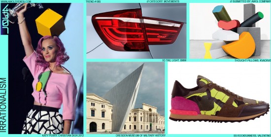
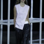
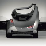
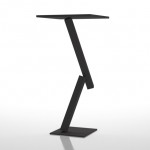
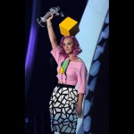
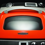
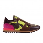
In the world of design, the careful study and application of the fundamental rules of aesthetics is the mark of a true craftsman. The aesthetic theme these rules have created, the modern movement of Rationalism, has deeply influenced the everyday objects in our lives. From the structures we live and work in, to the digital and physical design of the mobile devices we carry with us, Rationalism is rooted in the Bauhaus principle of “Form Follows Function”. This modern aesthetic seeks a completely logical, intuitive, and purposeful design solution for every aspect of a product experience. But a counter-movement has risen in parallel with this overly sterile and often boring stylistic mode: Irrationalism, and it is hell-bent on breaking all the design rules that permeate our stylistic landscape. If Rationalism always seeks to provide a visual response for the question “Why?”. Irrationalism’s counter-response is always: “Why not?”. Pop culture provides some stellar examples of this attitude: “Why do you have a large yellow cube on your head, Ms. Perry?” or “Why are you wearing a dress made of meat, Ms. Gaga?”. “Why not” is the only answer that need be given, as these choices not only defy rational explanation, but sharply disrupt our cultural preconceptions to the point where no explanation is even sought. To even try to explain would be to lessen the impact, to falsely imbue rational meaning where (purposefully) none should exist. So how can we define something that defies explanation, and especially how can we employ it appropriately in our creative processes? I once grew up with a kid who for a time wore his pants backward. Completely irrational, and he certainly couldn’t provide a reasonable explanation when confronted. But it gave him a secret pleasure, his own rebellious way of throwing a small stone against the glass wall of rules that defined his adolescence. Although his claim to have inspired the fashion stylings of Kris Kross was likely without merit, his example helps point the way to some basic insights about Irrationalism. When the category you are designing within is defined by generic sameness, or widespread adherence to engrained preconceptions, or simply looks overly inspired by the elements of Rationalism, then Irrationalism may be just the right tool to break the ice. Use Reinterpretation to take a basic design element (i.e. pants), and completely change its relation to the whole composition: scale it, bend it, re-color it, fracture it (or wear it backwards). Or use the power of Juxtaposition: force disparate elements together to create purposeful dis-harmonies. In a world defined by symmetry, explore asymmetrical solutions like the BMW X-Coupe, Nissan Cube, or TurboChef concepts. Although there are hundreds of ways to do this wrong (commonly called “bad taste”), a wide range of exploration will help ignite the spark the produces that one solution that is unquestionably right. Just don’t try the pants one, that’s already been done.
























Hi Andy,
Great article. I’d like to have a dialogue with you to discuss how this and other forms of communication fits into the context of Brand Thinking, BT. I believe it could be an interesting discussion that may help us and others to further put trends in context to people, brands and their cultures.
All the best and Happy Marry Everything from Sweden
Jonas
Hey,
what an awesome job you do man…. keep on it, that is why design is getting more and more important each day
brazil here 🙂