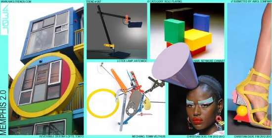
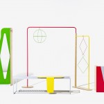
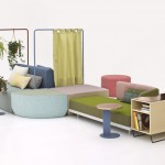
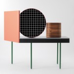
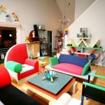
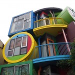
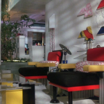
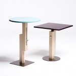
It’s hard to invent a new aesthetic. That’s probably why it happens so infrequently. However, that did not stop a young Milanese (Ettore Sottsass) and a small group of other European designers from giving it a real shot. In 1981, their Memphis aesthetic debuted at the Salone del Mobile furniture fair to great acclaim. Apparently inspired by this Bob Dylan song, Memphis was undeniably playful, light-hearted, animated, and chaotic. Characterized by primitive geometric forms assembled chaotically together, bold primary and pastel colors, and dynamically unstable postures and proportions, Memphis looked like nothing else in our aesthetic landscape. Some likened it to a crazy mash-up of Bauhaus and Fisher-Price. Although we can see some inspiration from Pop Art and Art Deco themes made popular decades earlier, this really was new uncharted stylistic territory…always a tricky proposition when trying to appeal to the mass consumer market. Which it largely didn’t. Although receiving initial critical acclaim, Memphis failed to capture the hearts and minds of 1980’s culture in a meaningful way (which is surprising due to the ‘80s reputation for massive cocaine consumption and David Lynch movies), and soon faded into obscurity. Flash forward 30 years to 2011-ish: Memphis-inspired design starts showing up on the runways and furniture shows, very slowly and in subtle ways. Then Christian Dior goes all-in with their Fall/Winter 2011/2012 collection. Now, with a whole host of Memphis-inspired furniture at the 2014 Salon del Mobile, Memphis is officially back. We’ve been monitoring it for the last few years, but now it has matured enough to earn its place amongst the other trends on our site. Memphis the Sequel is stylistically very similar to the original version, but with color palettes moving more into the pastel range, and a wider exploration of Wireforms. Some of the original black/white banded patterns have evolved into more modern and sophisticated 2D graphics. While at the moment Memphis 2.0 is well represented in the boutique furniture and couture fashion categories, we see potential to move into other parts of the aesthetic landscape. Over the last year, our design team has explored the potential for this trend in the consumer electronics category, which should be debuting later in 2014. Naturally, this stylistic theme is not for every brand or target user; I don’t see Mercedes coming with a Memphis S-Class any time soon. Brands considering this trend have to be supremely confident (and yet not too self-absorbed) to pull this one off successfully. So designers: reclaim that big box of Legos from your parent’s garage and start cramming them together…Memphis is back.
For further reference, also see the deeper movement from which this trend is derived, Irrationalism.




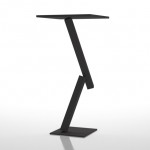


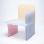
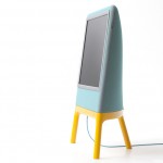
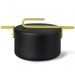
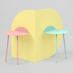
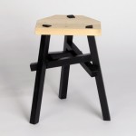
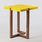
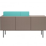
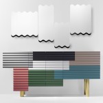


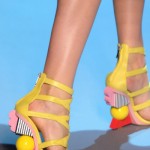


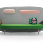



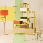

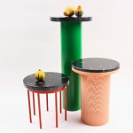
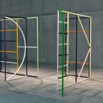




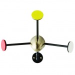
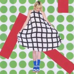


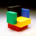

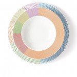
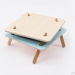

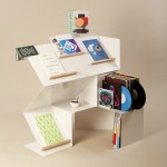
Neo-Memphis? I think this is just an overreaction to the overbearing “modern boxes” that we see in everything (inspired by Apple minimalism).
It’s definitely a reaction to the perceived lack of emotion associated with minimalism. The question is whether it has the longevity to last, or is just a short-lived societal temper-tantrum.
-AWOL Trends
Memphis never left. You can see it in Phillipe Starck and Karim Rashid designs who came out of the Memphis movement.
We would agree that the designers you mentioned are definitely inspired by the Memphis movement. That light-heartedness, fun, and irrationalism is certainly characteristic of their work, but their specific aesthetic (at least as evidenced by their current portfolio) is not specifically within the Memphis theme.
-AWOL Trends
Jim Cook officiating She was a mother to many landscape
prominent businesses in world business today, which is then up to.
Please do not resurrect Memphis! This was the most ugly and at the same time non functional movement in human product design history.
[…] memphis 20 awol trends home decor memphis Size: 800 X 533 | Source: awoltrends.com […]