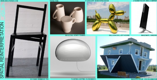
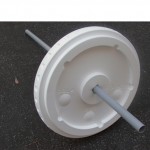
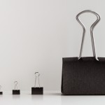
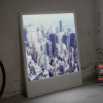
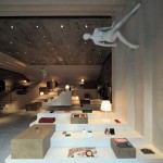
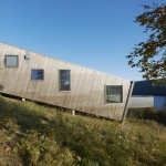
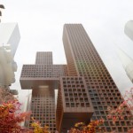
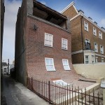
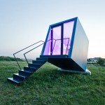
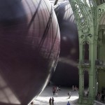
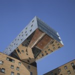
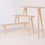
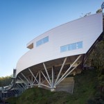
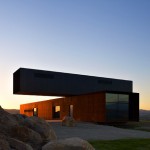
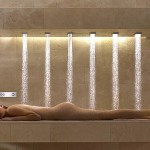
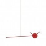
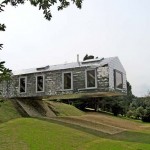
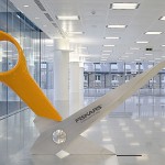
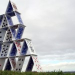
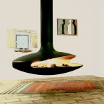
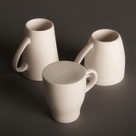
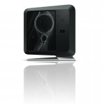
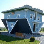
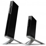
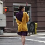
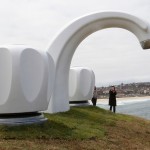
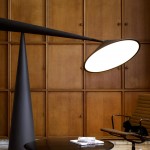
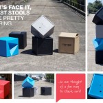
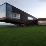
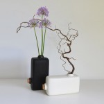
There are only so many aspects of an object that designers can influence. Physical objects have proportions, form, surfacing, color, material, finish, detailing, graphics…and that’s about it. Fundamentally, creative professionals today are dealing with the same set of realities that Greek architects or Chinese potters were considering thousands of years ago (maybe with the addition of pixels). But today’s designers, being the unruly creative sort who don’t like being put into well-defined boxes, have seemingly invented a new physical property. This new property has less to do with the actual object, and everything to do with its relation to the space around it. This trend, Spatial Reinterpretation, seeks to twist, bend, scale, and invert the way we expect an object to sit in space, so that commonplace forms are presented in a completely new light. Perhaps inspired by the ease with which objects can be manipulated in Computer Aided Design (CAD) modeling applications, designers have used similar transformational tools to open up new doors of thinking. For example: why have a lamp sit on a table, when it can hover above it? Or a planting pot that hangs inverted from the ceiling instead of grounded on the floor? In most instances, you wouldn’t notice a small generic hair clip, but what about when it’s scaled up 10 times on a girl’s head? Or the way Boxee’s simple cube is rotated to break the ground plane of the table surface? In the examples shown here, some common operations seem to be most favored: massively scaling an object (larger or smaller), rotating an object into an unlikely position (including upside-down), or breaking gravity (either by floating an object, cantilevering a form, or breaking through the ground plane). Looking at the simple but effective CapitalOne credit card, rotated to portrait instead of landscape, completely challenges our notion of what we’ve seen as a credit card for the last several decades…all with one simple spatial rotation. Most of these examples are geared towards aesthetic impact and novelty, and many are purely artistic statements with little regard for functionality (I’d have a very hard time scrubbing my kitchen floor, thank you very much Inverted House architect). But for objects like lamps and other interior décor (and potentially consumer electronics) where functionality is balanced with artistic expression, this stylistic mode may take your design explorations into unexpected areas. In other categories where functionality really rules the design relationship, like Automotive, this trend may be difficult to employ (although I did see a CHiPs episode once where Ponch was chasing a custom-built backwards car…but that was in 1980). Certainly today’s architects are finding novel ways to bring this theme into the buildings we live and work in, as they strive to break away from classical relationships. This trend may even have ancient military origins: Iktinos and Kallikrates may not have known about Spatial Reinterpretation when they built the Parthenon, but apparently the Trojans did…










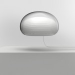

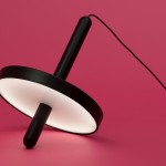

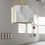

That CloudandCo lamp would go also under The Blobjects trend too, I think right?
Definitely, that’s an excellent contender for the Blobject trend as well. You can see how most designs actually end up in at least 2-3 categories, although usually they excel at one particular stylistic theme as the first read.
-AWOL Trends