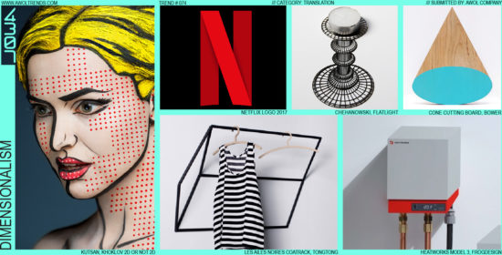
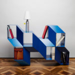
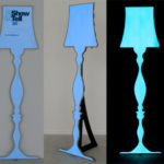
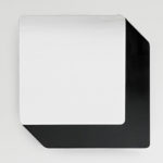
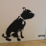
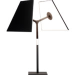
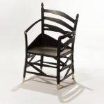
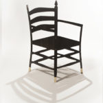
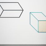
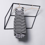
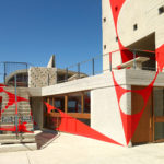
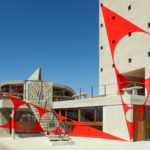
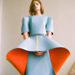
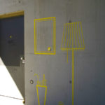
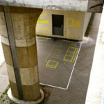
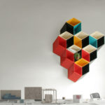
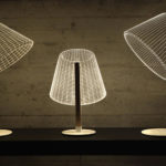
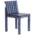
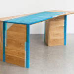
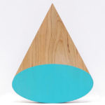
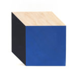
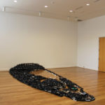
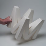
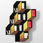
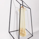
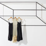
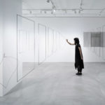
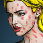
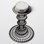
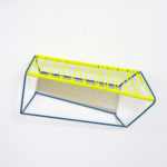
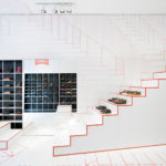
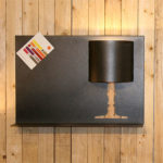
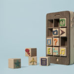
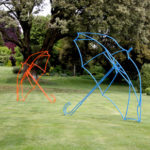
The discipline called “Design” is very broad, encompassing everything from Architecture, Fashion, and Product design to Graphic, Digital, and Brand Design. Generally designers specialize in one of these specific areas, and rarely work across disciplines. One of the strongest factors that divide designers is the boundary between two dimensions and three dimensions. Three-dimensional design encompasses everything in our physical world from buildings to shoes to sunglasses. Two-dimensional design includes flat physical objects like print media, but also includes the entire realm of pixel-based creativity like digital interface design and web design. The boundary between these two dimensions is an extremely high wall that few creative professionals ever surmount, (being 3D designers, when clients ask us to work in the 2D discipline we quickly refer them to the professionals). But that isn’t stopping brave designers worldwide from exploring the unique creative territory that lives at the divide between these two modes of expression. This new trend (Dimensionalism) doesn’t so much reflect designers crossing that boundary as it does explore that boundary by translating traditional two-dimensional objects into three-dimensional space (or vice-versa). For example, a growing trend in brand design is to explore 2D corporate logomarks with some element of ribbon-like twisting and shading that is rooted in the 3D world (as in the Chevron and Netflix logos). Some of these concepts in fact cross the boundary multiple times, creating new aesthetics that are at once both familiar and fresh. For example, the Kishu candlestick by Maya Selway is a 3D physical object of a 2D gestural sketch of a 3D physical object. Then another candlestick (Chehanowski’s Flatlight) is a 2D printed object (paired with a 3D candle), of a digital 3D wireframe model of a real-world 3D candlestick. This later example adds the additional translation of moving from digital to physical as well. Frogdesign’s new Heatworks Water Heater is a physical 3D block, expressed as a flat isometric 2D representation of a 3D cube. What makes this trend work is that the viewer is presented with layers of familiar objects and icons, which trigger instant familiarity with the object. But that familiarity is playing against our brain’s preconceived notion of what proper dimensions those icons should inhabit. Adding another mind-bending layer to this trend, some designers are adding the effect of optical illusions to further tease the perceptions. Escher-like 2D graphics on 3D objects, such as Deadmedia’s Skull or Felice Varini’s large-scale architectural graphic illusions really push the brain’s ability to rationalize what is being observed. These translated objects probably resonate best in particular categories, as they occasionally sacrifice usability or ergonomics to achieve this effect. We’re not sure Ibride’s Hidden Chairs would be actually comfortable to sit in, but they are definite conversation pieces. Anyone willing to push beyond the 2D/3D border, maybe into 1D or 4D? Maybe take some Advil first in case your brain explodes.
For related trends, also check out Digital Reality

