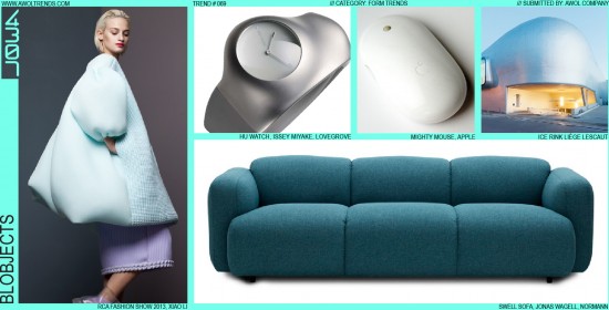
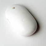
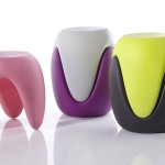
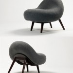
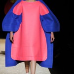
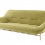
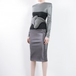
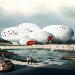
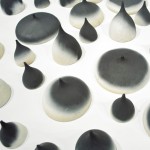
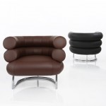
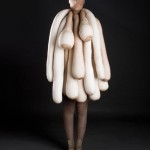
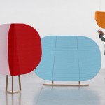
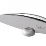
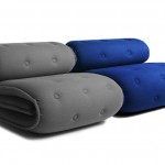
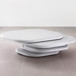
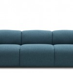
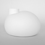
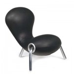
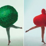
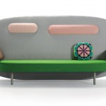
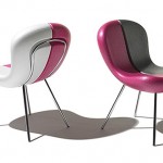
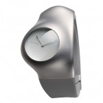
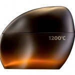
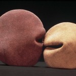
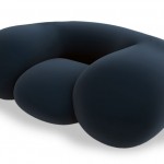
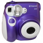
The term Blobjects was coined in the 1990’s to represent an emerging trend in product design. Blob-Objects were increasingly finding favor with designers who were empowered by the ability of new 3D CAD software to sculpt and deform organic shapes. This most likely emerged as a counter to the more angular, severe forms generated in the previous decade (when digital tools were still in their infancy, and forms and graphics were still a product of analog thinking and processes). Ford introduced a rounded, blobby design language with the Taurus, and continued to evolve this aesthetic for the next decade (and other brands followed with their own blob-cars, the new VW Beetle, the Chysler PT Cruiser). At the time, Blobjects seemed fresh, friendly, simple, and imbued with a certain whimsical personality that defied harsh boundaries. They were often paired with intense colors, elliptical graphics and parting lines, or massive, almost anatomical, animated forms (as in the Swiss theater troupe Mummenschanz). It’s no mistake that the first forms we tend to create as humans (play-dough shapes, crayon scribblings, poopies) tend to be very blobby. Despite the fact that 3D CAD tools have been in common usage for many years now, the appeal of Blobjects has yet to completely fade from the aesthetic landscape. More modern interpretations of this trend have seen it move beyond Automotive and Product categories, and into Furniture, Architecture, and even Fashion. Some designers have even made it their personal signature style (Karim Rashid and Ross Lovegrove, we’re looking at you), hitting every design challenge with the same Blobject hammer. Apple has even thrown out the occasional blob in their history (the Mighty Mouse, the iBook laptop). So where should Blobjects reside in the designer’s toolbox? Certainly in ergonomic instances, a heavily rounded form might conform to the hand or body more easily than an edgy form. Or if visual juxtaposition is the goal, a Blobject building set against a multitude of rectangular structures will certainly stand out. Blobjects are definitely not suitable for every creative situation, as they tend to have negative associations including heaviness, largeness, lack of sophistication, and whimsy. But for the right application, the right brand, and the right target user, big fat jelly beans might be just the ticket (although we haven’t found that magic combination yet in our design engagements). We’d really like to move this to the Declining Trends category, but creative professionals around the world seem to constantly be reinvigorating this theme, especially in non-Product and non-Automotive categories. But be warned, we’re poised to stick a fork in this potato and call it done.
For related trends, also check out Primitives and Naturalism.


























I remember years ago reading an article where the head designer for Lexus was describing the design process for the Lexus 300. He had his designers squeeze inflated rubber balloons to see what sort of shapes were produced. Then he explained this was how they came up with ideas on how the car would look. Interesting.
The blob object design trend can be traced back to Professor Luigi Colani. He was invited to Japan in 1982 by major companies such as SONY and Canon to promote his ideas oabout nature inspired bio-design as an alternative to the BRAUN / Ulm school of design. He became one of the most famous designers in Japan during the 1980s ,and his organic style was widely imitated. Both Karim Rashid and Ross Lovegrove cite Colani as inspiration.
More details of Colani’s designs can be seen here:
http://www.colani.org