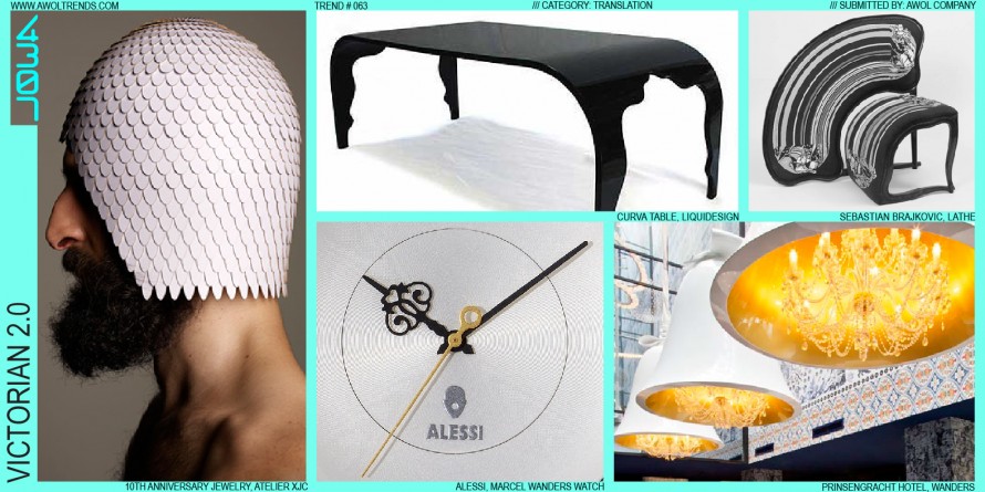
Many have said that Design is communication. Typically designers are trying to express elements of a brand’s values, or communicate a device’s functionality or proper method of use, or weave a narrative about the relevance of the object in a person’s life. Sometimes, “because it looks cool” is as deep...
Read more
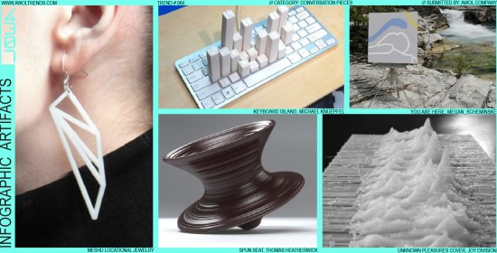
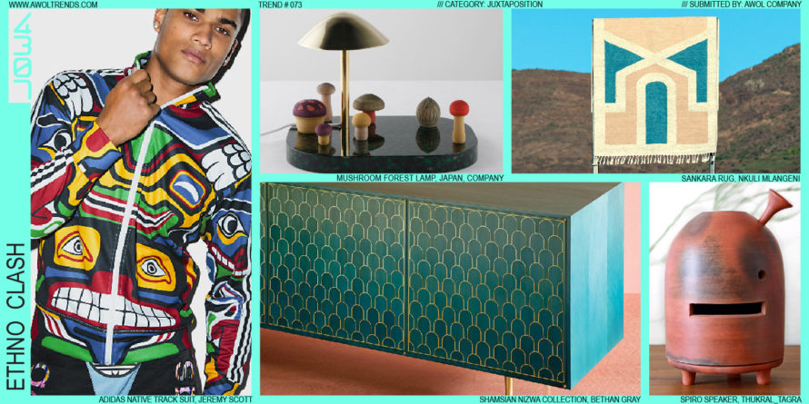
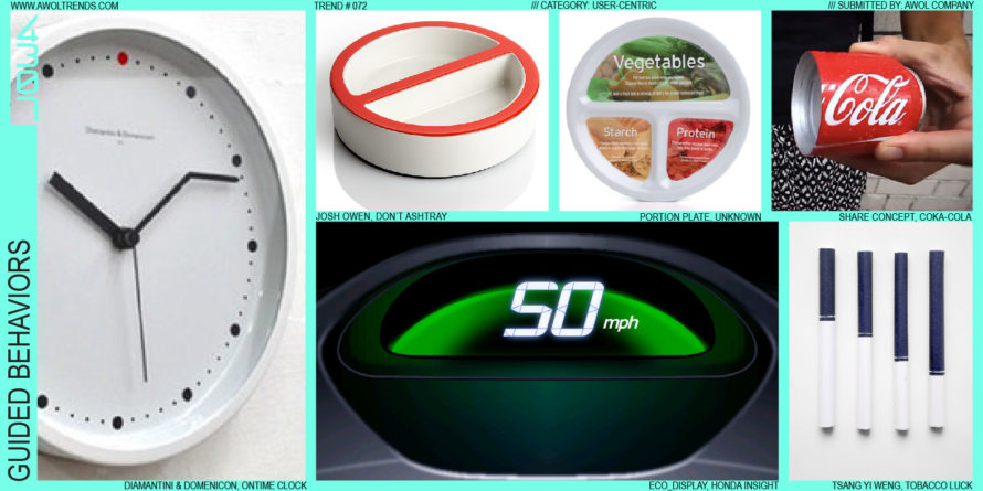
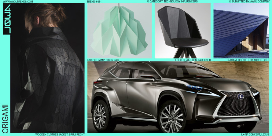
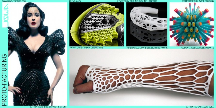
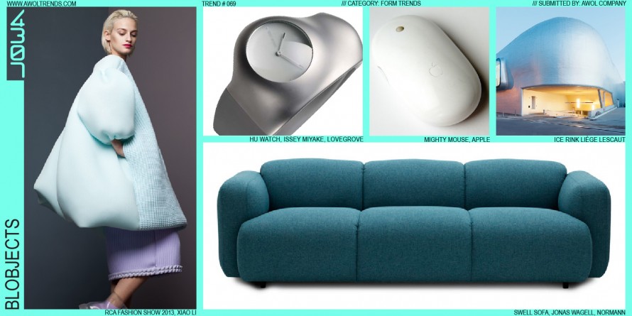
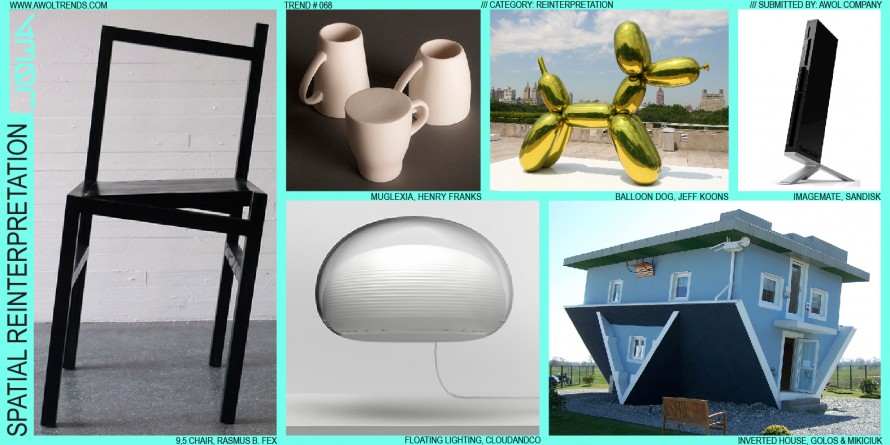
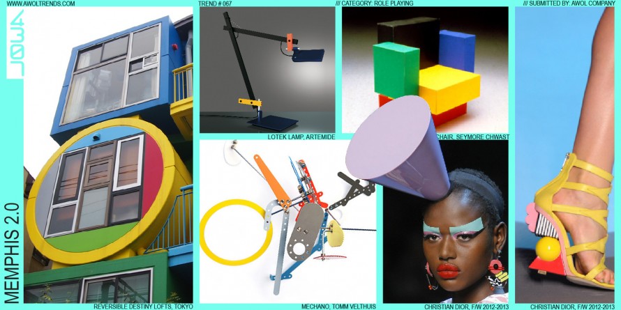
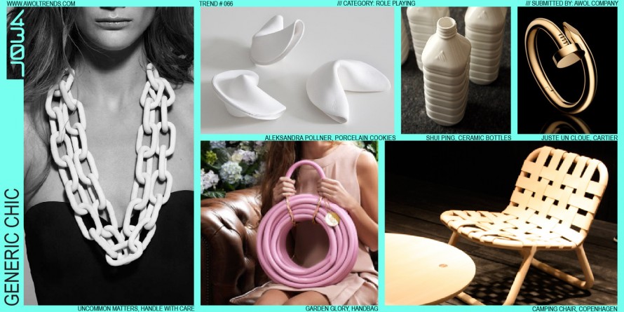
INFOGRAPHIC ARTIFACTS