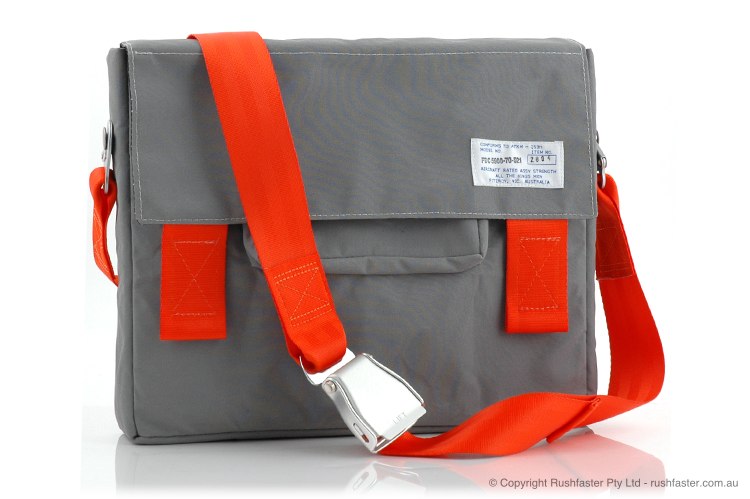
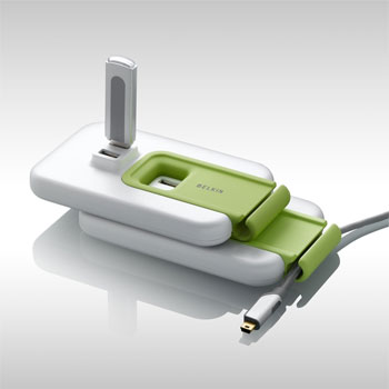
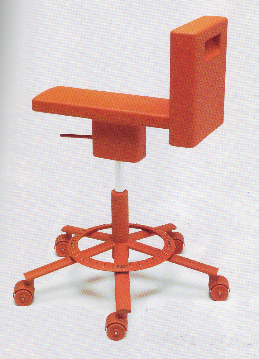
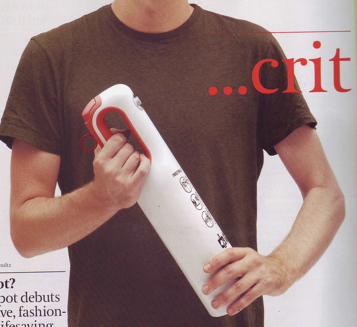
The term “affordances” came to be used in interaction design to indicate a visual cue to indicate the proper way for a user to interact with a device. That scoop under your door handle is an affordance, telling you where your fingers go in a visual language that all humans can understand. Enlarged hand holds are the most common usage, but there can also be color, or form, or proportional cues that clue users in to the proper modes of interaction. These are incredibly powerful tools that tame the complexity of technology, especially when dealing with first-time users, people who don’t read instruction manuals, people with language barriers, or the differently-abled. While these aesthetic elements are not new to design, their exaggeration and emphasis as primary 1st-read elements has become a common theme. There is a tendency for products using this theme to lack sophistication, or be perceived as toy-ish, due to the frequent use of bold informational colors and gross handle elements. However, pairing this trend with the right amount of rational geometry can minimize this effect, as can careful control of the scale and proportion of the affordances. Also, this visual theme will create an immediate intuitive understanding in the user’s mind. This is great for leading users into proper methods of interaction for first-time use, but the effect can be overpowering on objects the user is already perfectly familiar with. For example, a house full of exaggerated doorknobs, handles, drawer pulls, closets, and light switches would almost take on a “handicapped” environment look. However, using Exaggerated Affordances on something infrequently (but critically) used like an in-home fire extinguisher or first-aid kit is much preferred.
EXAGGERATED AFFORDANCES

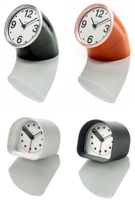
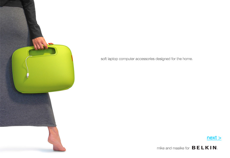
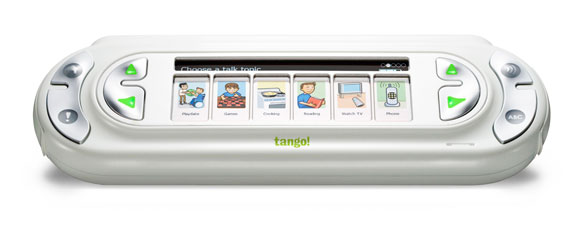

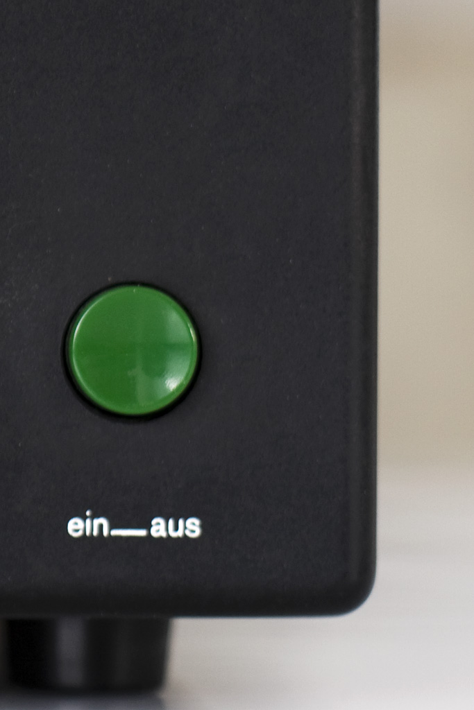

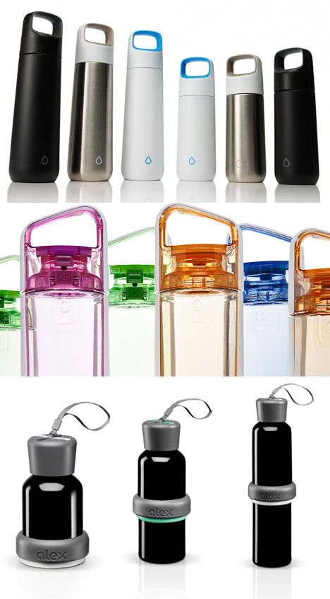


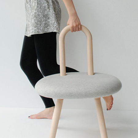
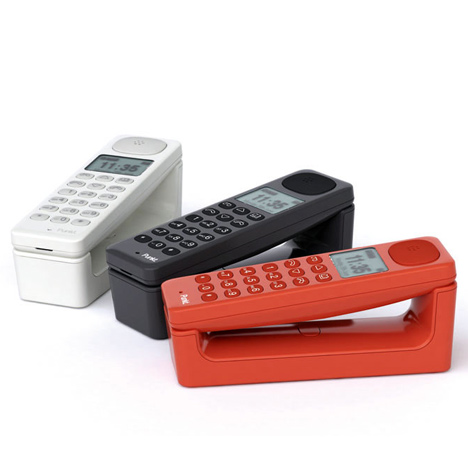
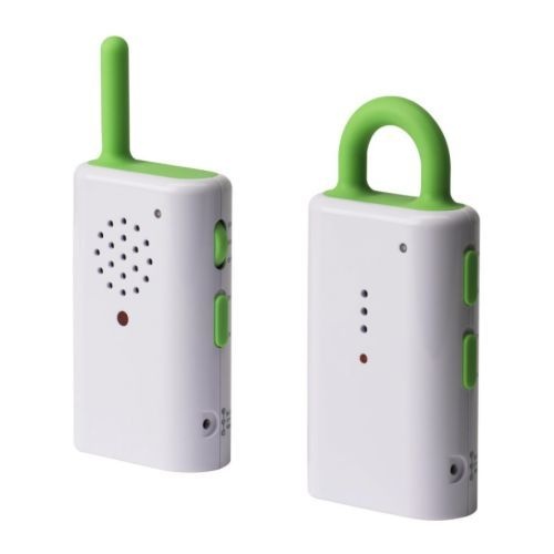
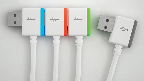
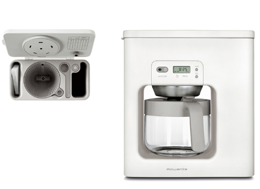

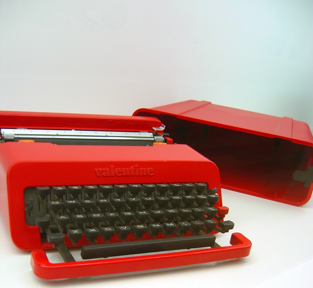
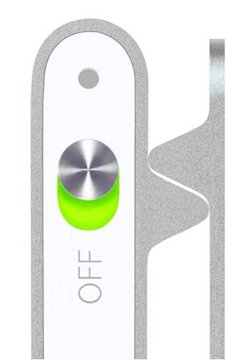

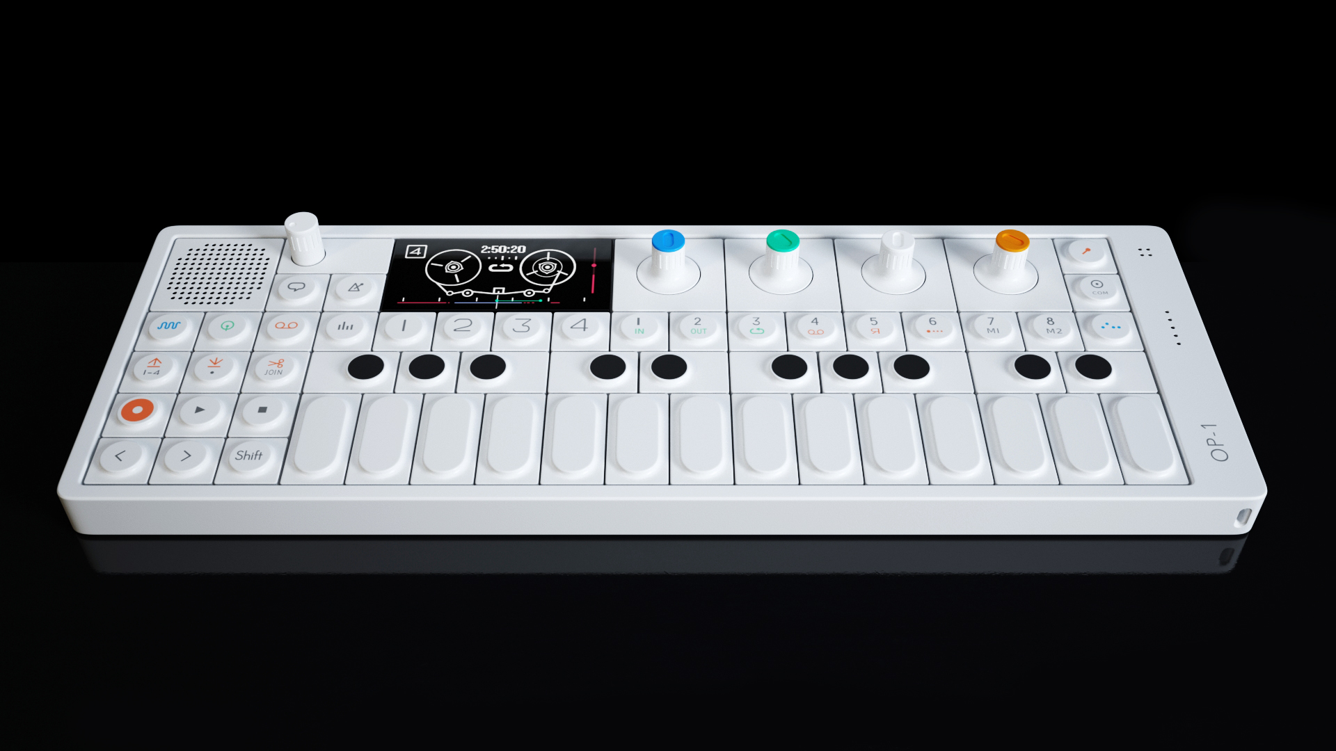
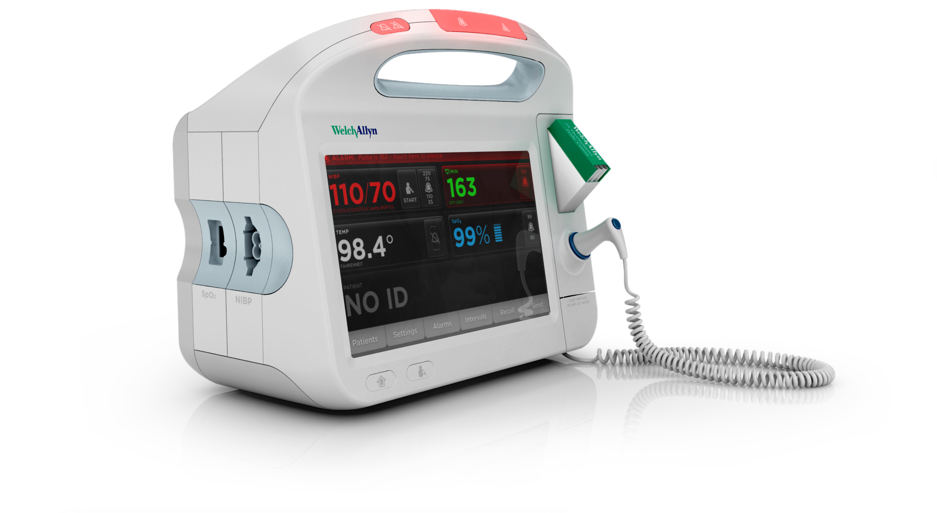
The subtle exaggeration in these designs reveals a “personality” and the desire to want to engage with each one.