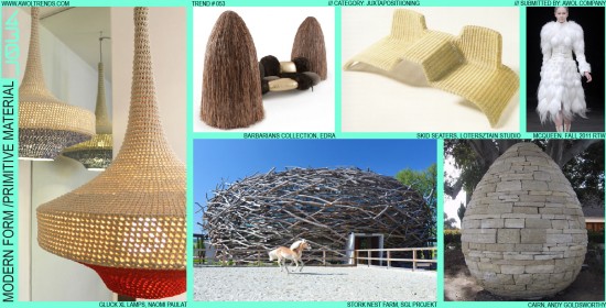
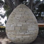
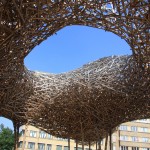
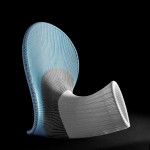
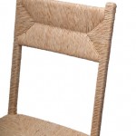
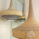
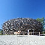
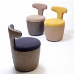
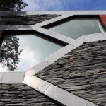
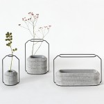
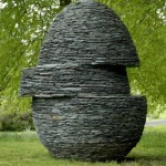
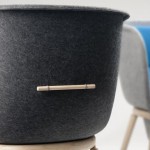
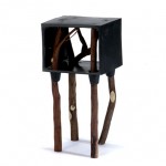
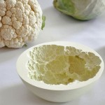
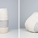
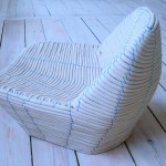
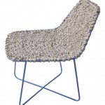
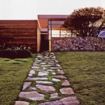
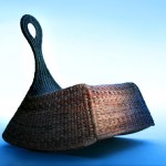
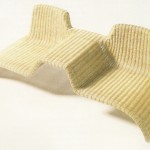
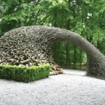
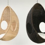
In keeping with the Juxtaposition category’s deliberate fusion of disparate ideas, this trend focuses on the union of both form and material, and past and present. This one-two punch of clashing design elements and design eras tickles our creative minds in all the right places. Using this method, we see clean, geometric, minimal, modern forms heavily contrasted with roughly-textured natural fiber weaves, primitive rough-hewn stonework, shaggy fiber piles, or even inter-woven tree branches. Such materials and process are typically associated in our collective mind with the long human history of the aesthetics of baskets, huts, boats, and other structures. Deliberately clashing these with the frequently cold, inhuman, rational aesthetics of modern minimalism brings a sense of warmth, relevance, and humanization. The great artist Andy Goldsworthy has long employed this method to re-frame our views of the natural world around us in incredible new ways. The first consumer product category to whole-heartedly adopt this theme has certainly been Furniture. These designers began with employing coarsely-woven fibrous bands (more typical of basket-weaving) to construct very modern geometric forms. Now, they have moved into more primitive fabrics like raw felt or course burlap. Few other categories have adopted this trend yet: we like our cars and consumer electronics shiny, and this trend is definitely not a good fit for achieving shininess. Maybe a mud-brick iPhone case? Or a rattan Bugatti?


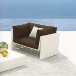
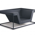
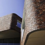
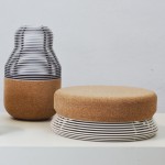
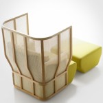
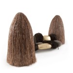
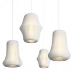
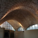
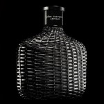
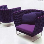
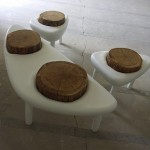
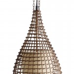

Love the shaggyness of some of these. Seems very appropriate for home, furniture, house wares. Have a hard time seeing it extend to automotive or consumer electronics. Not to say it couldnt…