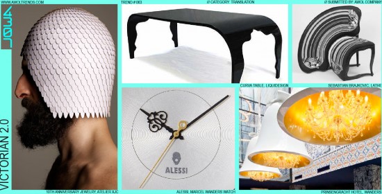
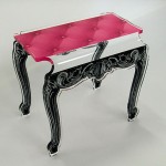
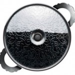
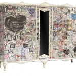
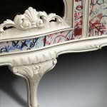
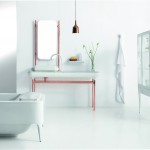
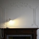
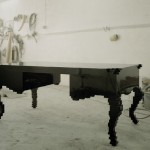
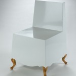
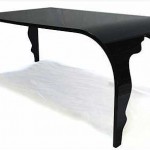
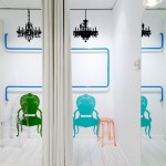
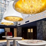
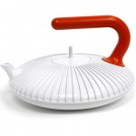
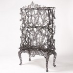
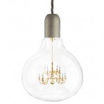
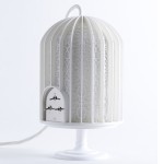
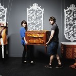
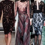
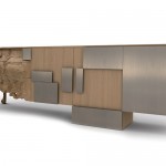
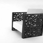
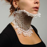
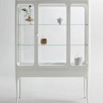
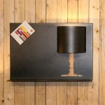
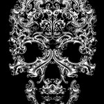
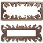
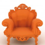
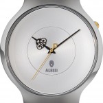
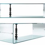
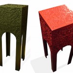
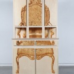
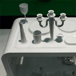
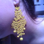
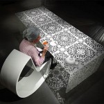
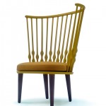
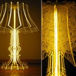
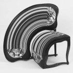
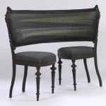
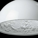
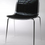
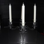
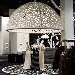
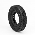
In Fashion, style is mostly cyclical (with repeating themes currently on a 25-year cycle). In other design categories, however, the wavelength has been a bit longer. Roughly 150 years ago, some clever folk called the Victorians set about changing the world with their Industrial Revolution and, among other things, their unique aesthetic. This was defined by intricate and flowing scrollwork patterns, exaggerated and animated proportions, and rich use of high-craft materials such as wood, metals, and silks. The style ultimately evolved into the naturalism of Art Nouveau and was in turn countered by the simple minimalism of the Craftsman and Modernist movements. The Victorian aesthetic laid dormant during the 20th century, hibernating in the homes of grandmothers everywhere. But flash forward to the mid-2000’s, and conceptual pieces with a distinctly Victorian inspiration started turning up at the Salone Internazionale del Mobile in Milan. From the uniquely iconic Queen Anne chair forms, to the delicate scrollwork patterns so characteristic of the period, modern designers found new inspiration in these ancient themes (“ancient” in the design world is anything over 40 years old). However, they weren’t just recycling these old themes, they were translating them to have relevance in our modern aesthetic landscape. Proportions were wildly stretched, color was boldly applied, new materials and processes were introduced, and the motifs were juxtaposed against clean modernist surfaces and finishes. From Furniture, this stylistic mode moved into Interiors (especially the luxury/modern club, lounge, lobby genres), and has spread into other areas like lighting, jewelry, and accessories. Some designers have even made Victorian 2.0 their signature style (Marcel Wanders’ lighting, chairs, watches, interiors, etc.), as the opulent-but-modern feel of this trend aligns with many of the various luxury and fashion brands. While most of the motifs can be characterized as Victorian, the category can be broadly used to encompass earlier periods such as Rococo, but trying to cram in Baroque would just be a step too far. Despite this trend being an obvious derivation of a pre-existing aesthetic, and having debuted over 6 years ago, Victorian 2.0 is still going strong as it moves into other categories (although it has diminished in its original Furniture category) . It would be interesting to see this tastefully applied in the Consumer Electronics or Automotive categories (without getting too Steampunk), where premium minimalism has seemed to have run its course…anyone up for the challenge?




I remember seeing this in chairs and tables over the last few years, do you really think it has an traction in other categories? I work in transportation design industry.
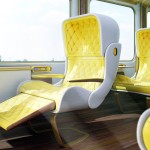
For the transportation industry in particular, this trend could be very compelling. Not sure whether you’re in automotive or mass-transit or which particular category of transportation, but it could be a compelling counter-aesthetic to the overly techno-styled interiors and exteriors that are seen today. It should be applied extremely lightly, though…avoid any excesses of the Victorian design cues that could start to look Steampunk. Maybe the shape of the speedometer needle, or an ornately styled door handle on an otherwise clean & modern surface. Or maybe tiffany-style interior lighting? Think subtle yet impactful.