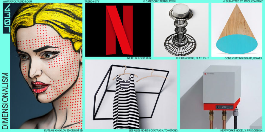
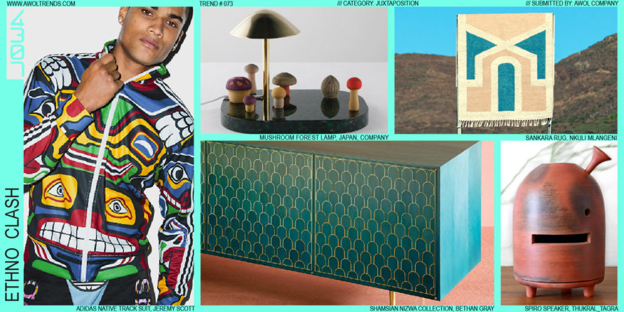
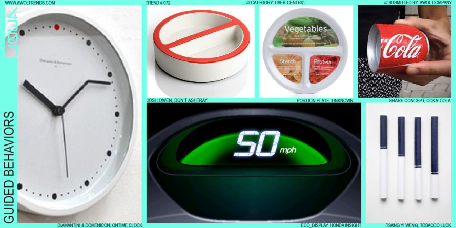
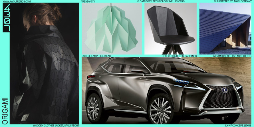
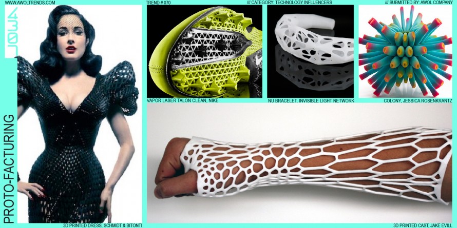
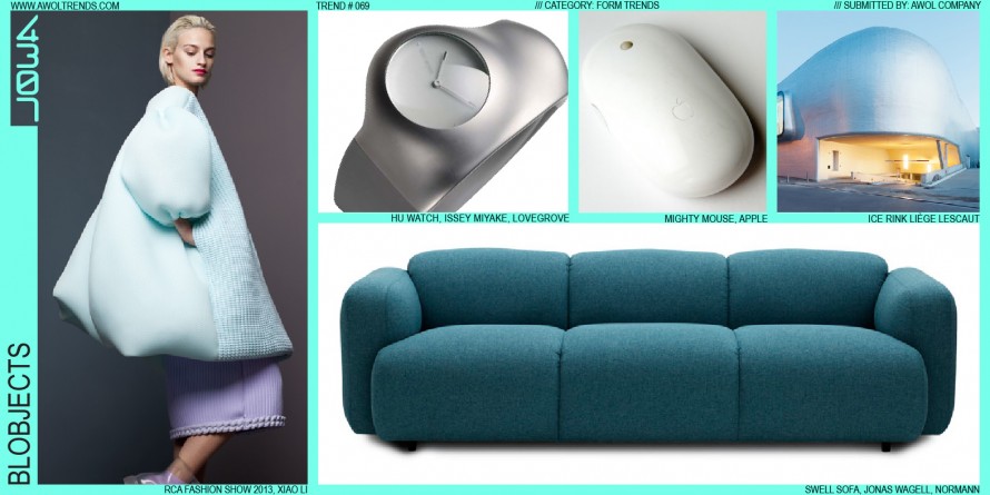
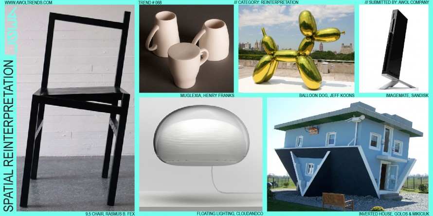
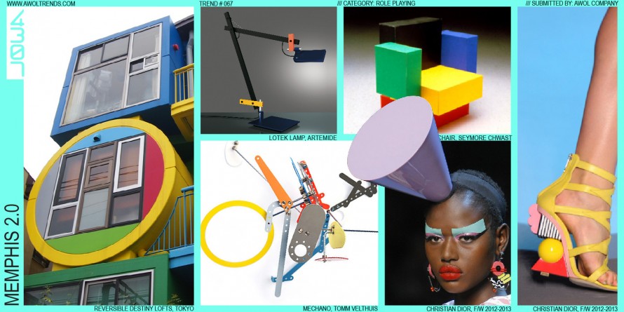
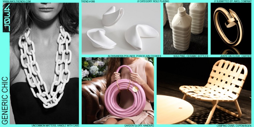
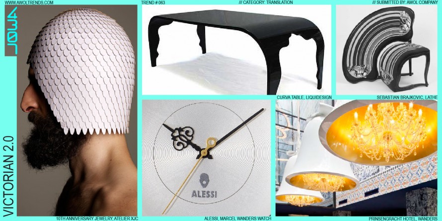
Some aesthetic themes arise purely as a counterpoint to an established visual mode. For decades, we’ve surrounded ourselves with increasingly polished, seamless, perfect objects; from smartphones to automobiles, the stylistic vector has been ever towards shiny, sleek, rational, and technological. Made by machines, with all hints of an artisanal human...
Read more
ORGANIC FORM/ GEOMETRIC MATRIX
The interplay between the organic and the geometric is at the heart of the Geo-Organic category. This trend is very closely related to Geometric Form/Organic Matrix, but inverts the relationship between form and structure. Whereas the previous theme employs highly rational, primitive, geometric forms supported by a chaotic cellular internal...
Read more
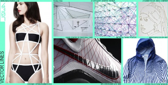
VECTOR LINES
We’ve posted several trends about the interplay between the digital and physical worlds. One aspect of the digital aesthetic that has emerged, coinciding with a broader revisiting of 1980’s design cues, is the Vector Line. Originally, this element was introduced via early 1980’s (even late 1970’s) arcade graphics: Asteroids, Tempest,...
Read more
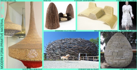
MODERN FORM/PRIMITIVE MATERIAL
In keeping with the Juxtaposition category’s deliberate fusion of disparate ideas, this trend focuses on the union of both form and material, and past and present. This one-two punch of clashing design elements and design eras tickles our creative minds in all the right places. Using this method, we see...
Read more
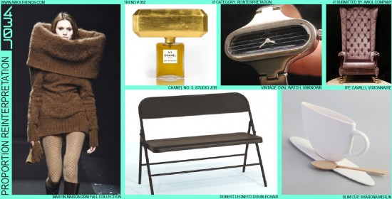
PROPORTION REINTERPRETATION
In keeping with the Reinterpretation category, this trend builds on the concept that familiar icons can be refreshed and revitalized by specifically amplifying a single key design attribute. Proportion Reinterpretation explores scaling, stretching, or compressing an object’s proportions. This can be simply scaling the object, stretching it along one of...
Read more
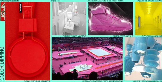
COLOR DIPPING
As designers, we’re always looking for a strong first-read stylistic element that will attract the target user’s immediate visual attention. In the last few years, a trend has emerged that exclusively uses a single color to create this aesthetic hook. Very simply, Color Dipping involves (sometimes literally) dipping a complete...
Read more
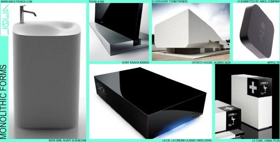
MONOLITHIC FORMS
With the misinterpretation of designers as “form-givers” yielding highly complicated, over-styled forms, several aesthetic themes have emerged to bring restraint and confidence to this over-worked design element. One of the most interesting to emerge has been Monolithic Forms. This stylistic mode involves an interplay of key elements: minimalism, massiveness, and...
Read more
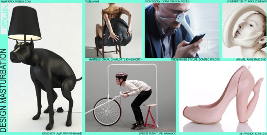
DESIGN MASTURBATION
Designers can be like busy beavers: even when not working on a client’s project for pay, they are always applying their talents to the world around them. Beavers not engaged in the grueling task of dam-building still have to sharpen their teeth and claws on any unsuspecting tree to keep...
Read more
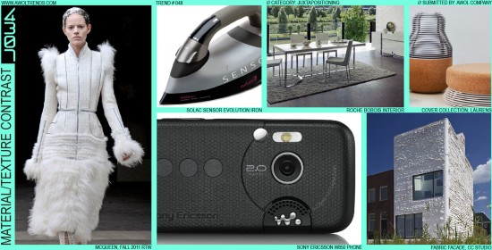
MATERIAL/TEXTURE CONTRAST
The 2000’s is the decade that designers, in all industries and categories, rediscovered texture. As Minimalism moved through the aesthetic landscape, highly simplified, clean, understated forms became predominant. However, to offset the potential visual boredom these simple shapes can suffer from, designers sought to break them up with the juxtaposition...
Read more
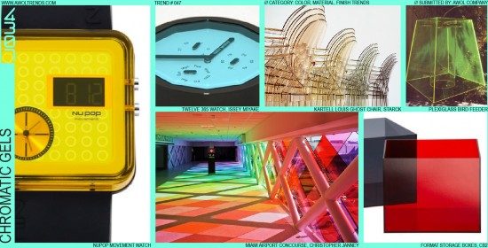
CHROMATIC GELS
There are only so many colors in the world. Despite Pantone’s claims to “invent” new colors, many of today’s designers are obsessing less about which exact PMS to specify, and more about how transparent it should be. Chromatic Gels is a trend that is finding traction from Architecture to Furniture:...
Read more
