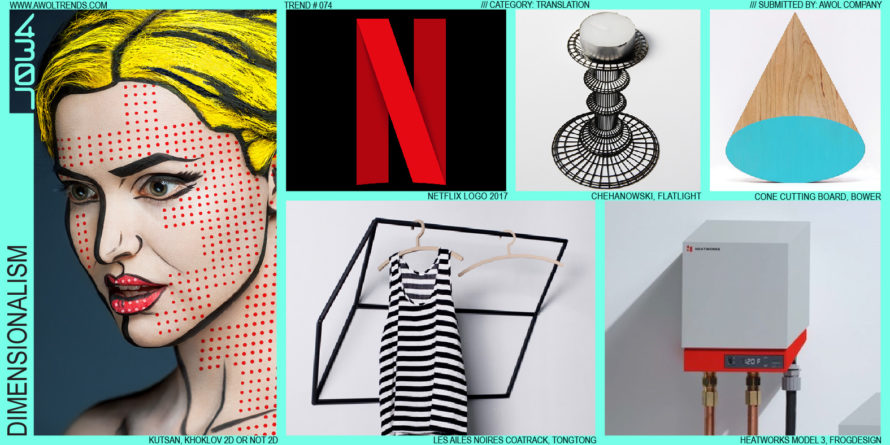
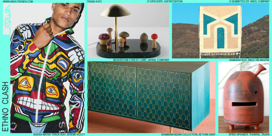
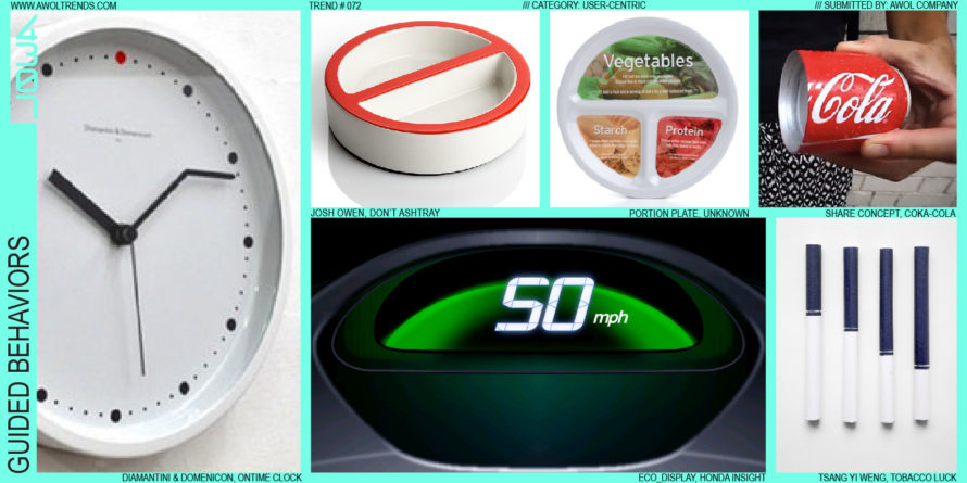
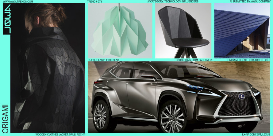
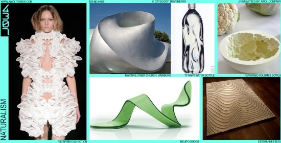
Throughout our collective history, across all cultures, and in all types of products, the inspiration provided by the natural world around us has found its way into our artifacts. The pendulum always swings from strictly literal motifs to more abstract inspirations: even some of our first recorded artworks like the...
Read more
TOPOLOGY
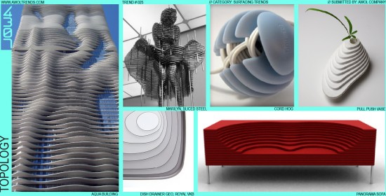
Although the idea of defining a surface via layers of concentrically sliced planes is not new (such as on topological maps), it was never a stylistic theme until appearing in the Furniture category in the mid-2000’s. Couches created through sliced two-dimensional layers of upholstered cushions gave way to tables constructed...
Read more
MAINSTREAM MILITANT
American culture has long been fascinated with war…lucky for us that their regular occurrence keeps the aesthetic of combat ever in the spotlight. From the colorful regalia of The Beatle’s Sgt. Pepper album, to the black-ops look of Jay Z’s Roca Wear, pop culture has appropriated the visual elements of...
Read more
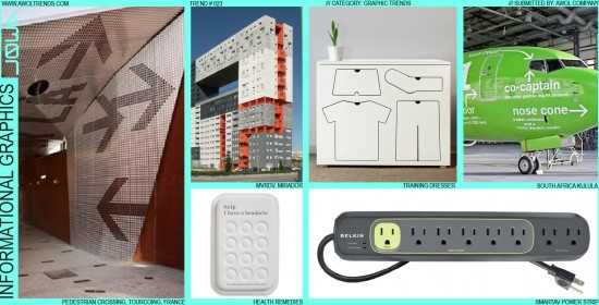
INFORMATIONAL GRAPHICS
The nature of most technology, be it a plane, a building, or a computer, is to hide the scary complicated internal workings within a simplified outer shell. For the most part, this out-of-sight-out-of-mind approach removes the level of intimidation most users feel when interacting with technology for the first time....
Read more
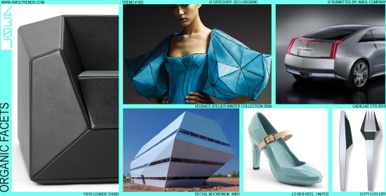
ORGANIC FACETS
In keeping with this category’s exploration of the interplay between the natural and man-made worlds, Organic Facets highlights a specific surfacing technique that embodies this tension. This method was inspired by the Stealth Fighter of the 1990’s, that matte-black, wedge-like assortment of triangles that seemed not only unable to fly,...
Read more
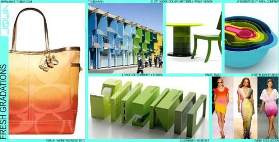
FRESH GRADATIONS
Although achievable easily in oils and watercolors, the gradations we see in the natural world around us have always been hard to replicate in production. The first explorations of gradation appeared in print with the invention of half-tone patterns. Not until digital tools arrived in the late 20th century did...
Read more
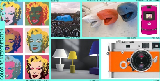
COLOR REINTERPRETATION
In keeping with the Reinterpretation theme, Color Reinterpretation maintains all design elements of the original icon, but alters the color in new and striking ways. Andy Warhol’s Marilyn prints illustrate this effect perfectly: taking the widely and immediately recognized icon of Marilyn’s face, and layering on a cascade of vibrant...
Read more
LIGHTING RE-IMAGINED
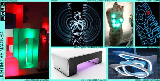
Lighting has been a persistent element of modern consumer electronics design since the early 20th century: early radios, vacuums, and ovens glowed with incandescent readouts. Little changed until the LED was introduced in the 1980s into consumer products, which revolutionized the ability of designers to add light both as a...
Read more
SILVER PAINT
Silver paint is a Declining Trend, but the story of its rise to glory is worth knowing. Around the late 1990s, starting in the Consumer Electronics category, silver paint started a decade-long march across the design community. The inception was most likely two sources: the long use of lightly metallic-flaked...
Read more
DESIGN COMMENTARY
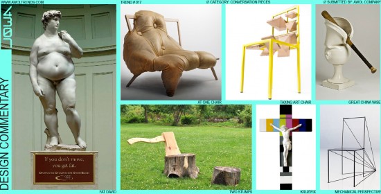
We designers have powerful tools at our disposal. We can quickly call upon 2D, 3D, physical, and virtual methods to re-envision the world around us in very convincing and compelling ways. Sometimes that energy is channeled not into developing design concepts, but rather to illustrate societal issues in new ways....
Read more

