The concept of minimalism has its roots in the mid-20th century, but is still a major design influence today (Apple and other consumer electronics manufacturers have embraced this principle, as have furniture brands like IKEA and CB2). Early minimalist artists and musicians sought to reduce a concept to its most basic, pure form, without any extraneous ornamentation or emotional embellishment. In the product design discipline (which adopted this stylistic mode as a founding principle of the Bauhaus movement), this typically means eliminating purely stylistic elements, removing, hiding, or combining features, and leaving large expanses of honest, unadorned surfaces. However, in this act of reduction there is universal beauty, truth, and simplicity. Think haiku vs. novel: reducing all elements to the most basic gesture that captures the essence of the design. As a general rule, if it doesn’t need to be there (to ensure the object’s functionality), then remove it. A common mistake is to pursue extreme visual minimalism to the point where functionality is compromised (ever try to tell time on a Movado watch?). Counter-intuitively, this aesthetic mode often translates into a higher unit cost: since there are fewer visual elements, each must be treated with an increased amount of care and attention in order to avoid the product looking cheap. Just one little bit of plastic flash or uneven parting line can destroy the entire premium effect, as is typically evident on Apple knock-off products.

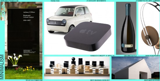











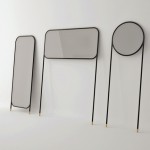
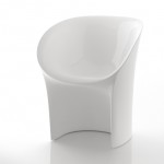


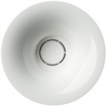


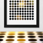
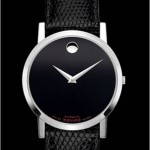


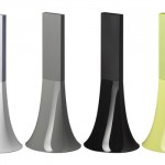
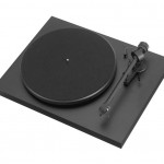


One of my favorite trends. No way to hide behind the design, every surface, curve and graphic has to be fully thought out and resolved!
[…] http://awoltrends.com/2011/08/minimalism/ […]